
Mobile App
Usability Evaluation and Redesign of the HSBC UK Mobile App

Project Overview
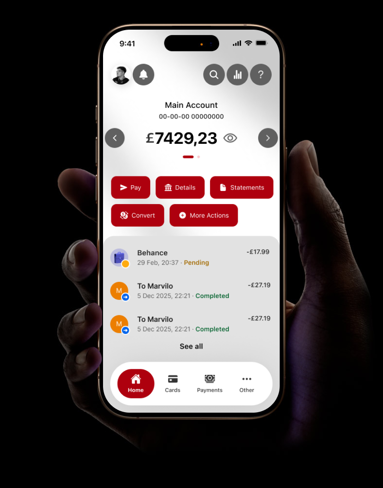
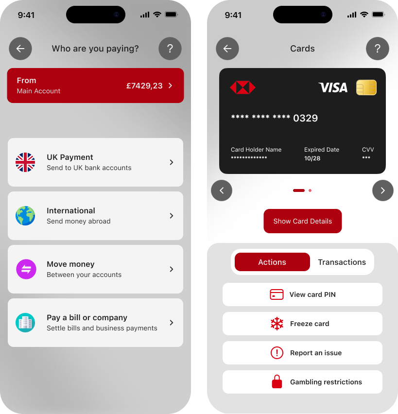
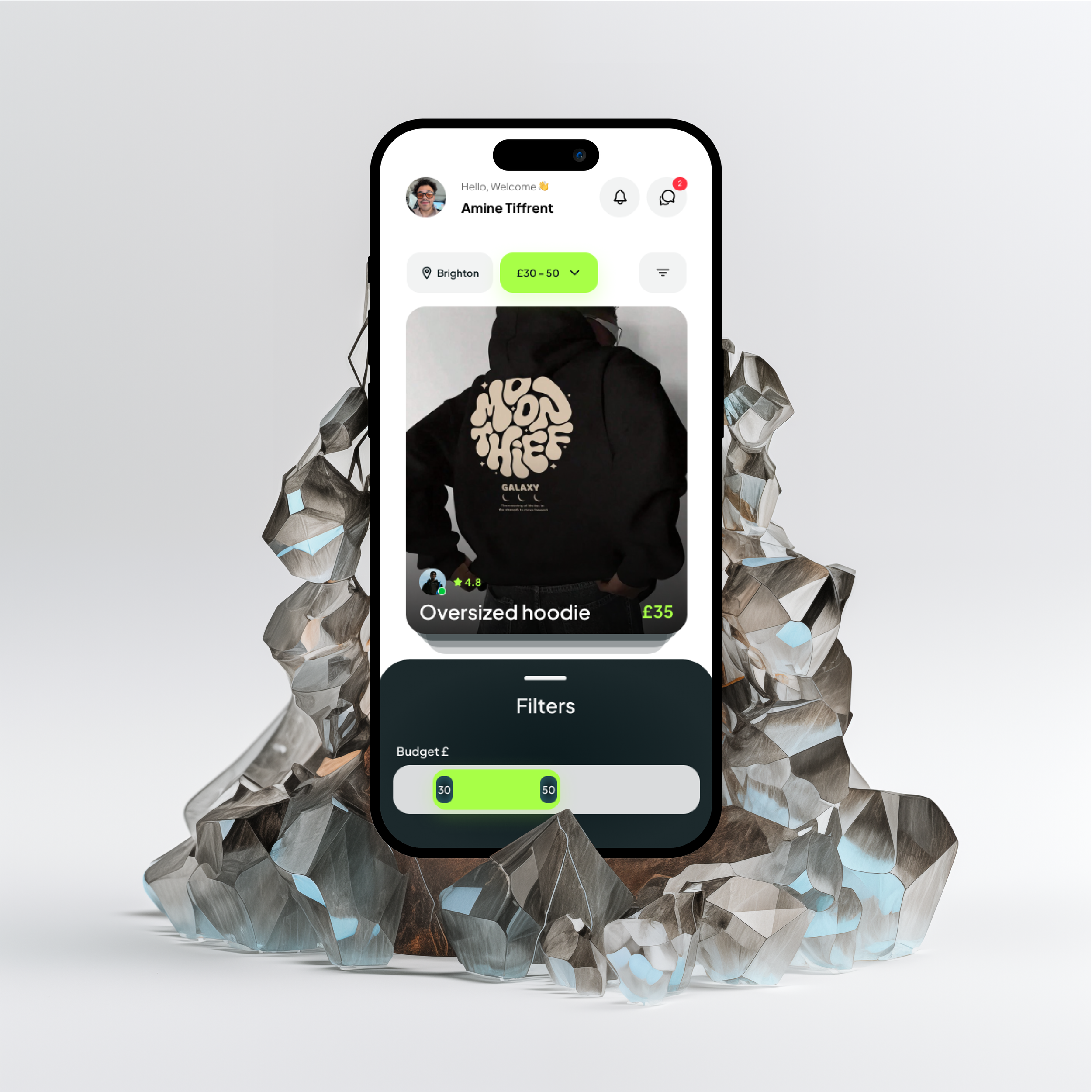
A usability-led redesign of the HSBC UK mobile banking app, focused on three core screens: Home, Pay, and Cards. The project combined expert evaluation, participant testing, prototyping, and accessibility review to produce a measurably improved experience.
Role: UX Designer
Methods: Heuristic Evaluation, Think Aloud Testing, SUS, Wireframing, Figma, Accessibility Audit
Tools: Figma, Stark, Vibe Coding (Antigravity)
The Problem
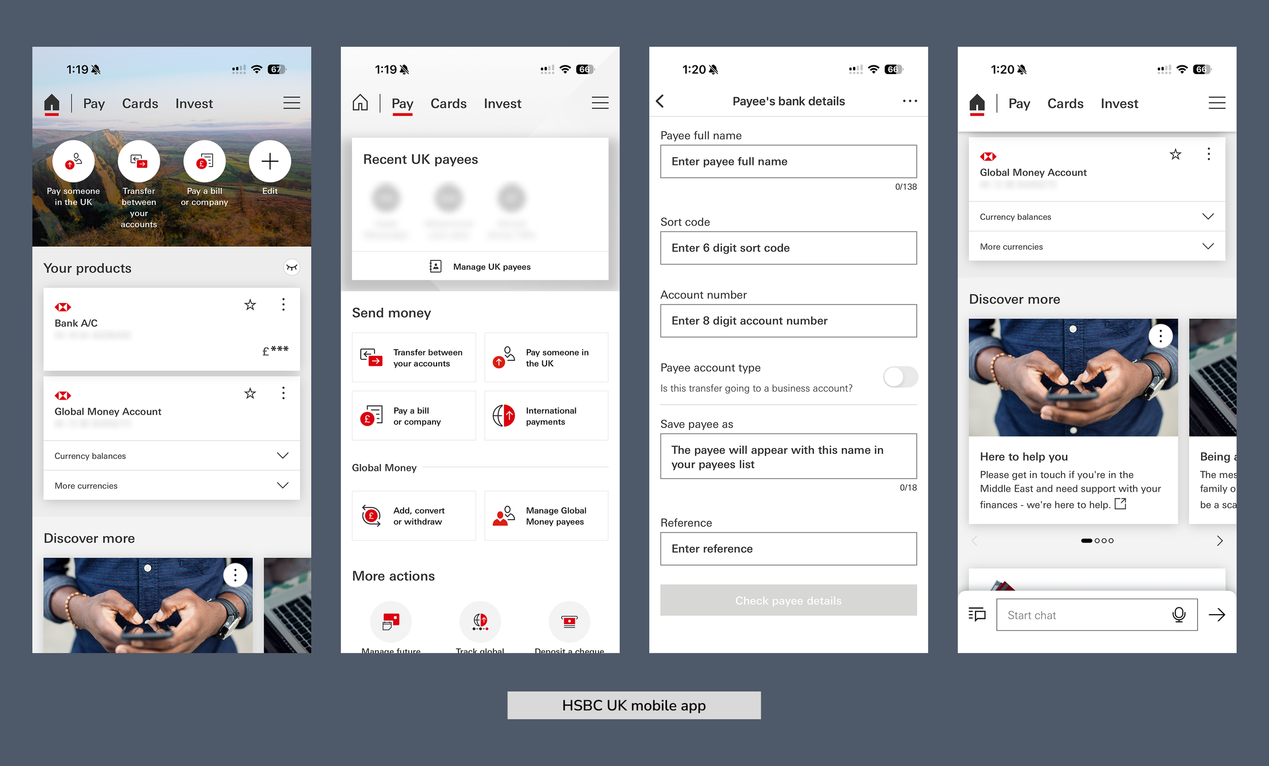
HSBC's mobile app underwent an 18-month redesign completed in 2025, yet users continued to report significant frustration. HSBC's own Head of Digital Channels publicly acknowledged the app had developed increasingly complex navigation, too many hidden features, and inconsistencies across customer journeys.
This project focused on three of the most used screens and explored whether a targeted, evidence-led redesign could produce a meaningful improvement in usability and task completion.
Competitor Analysis
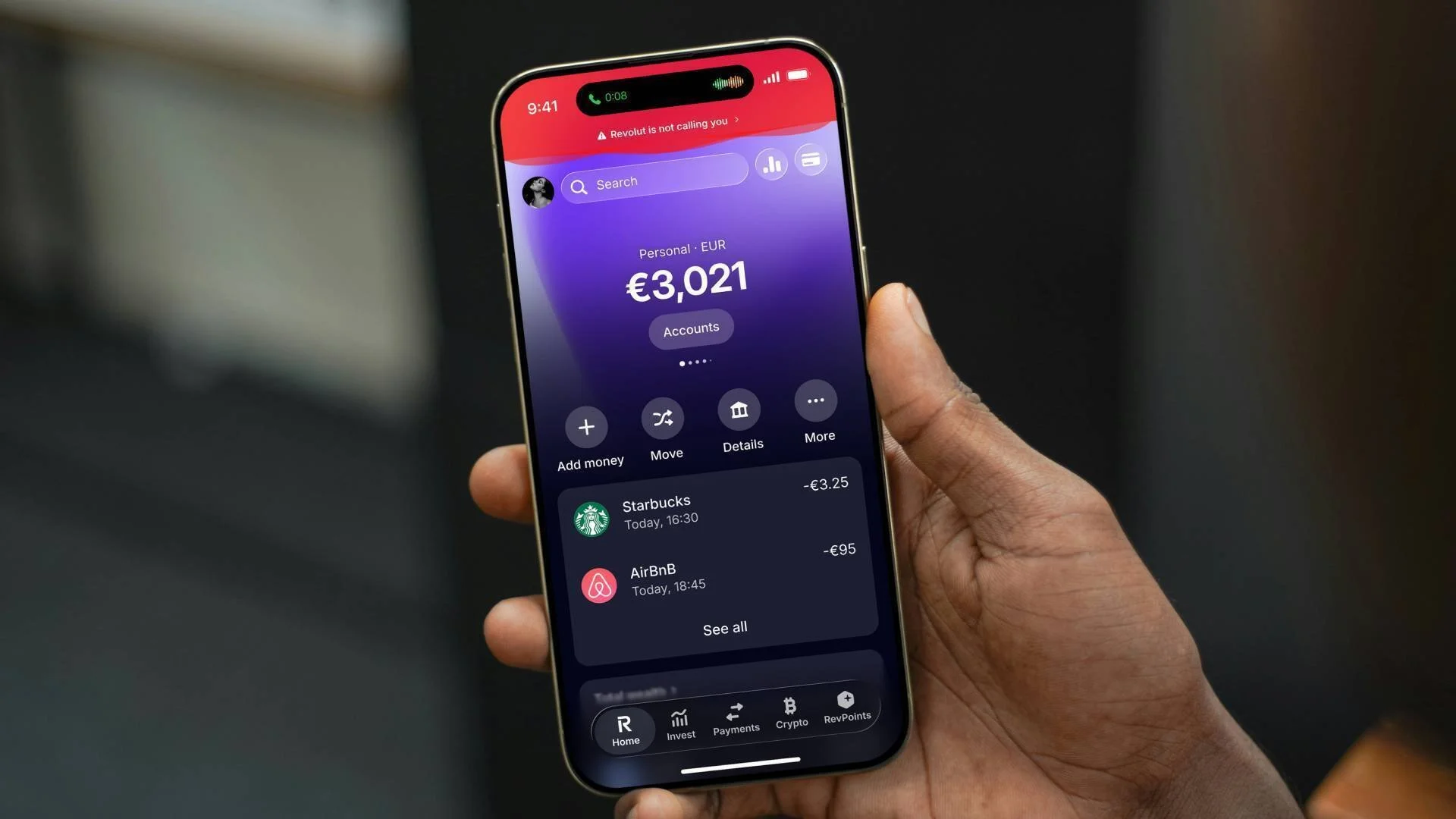
Revolut
Revolut is an all‑in‑one finance app built around multi‑currency accounts
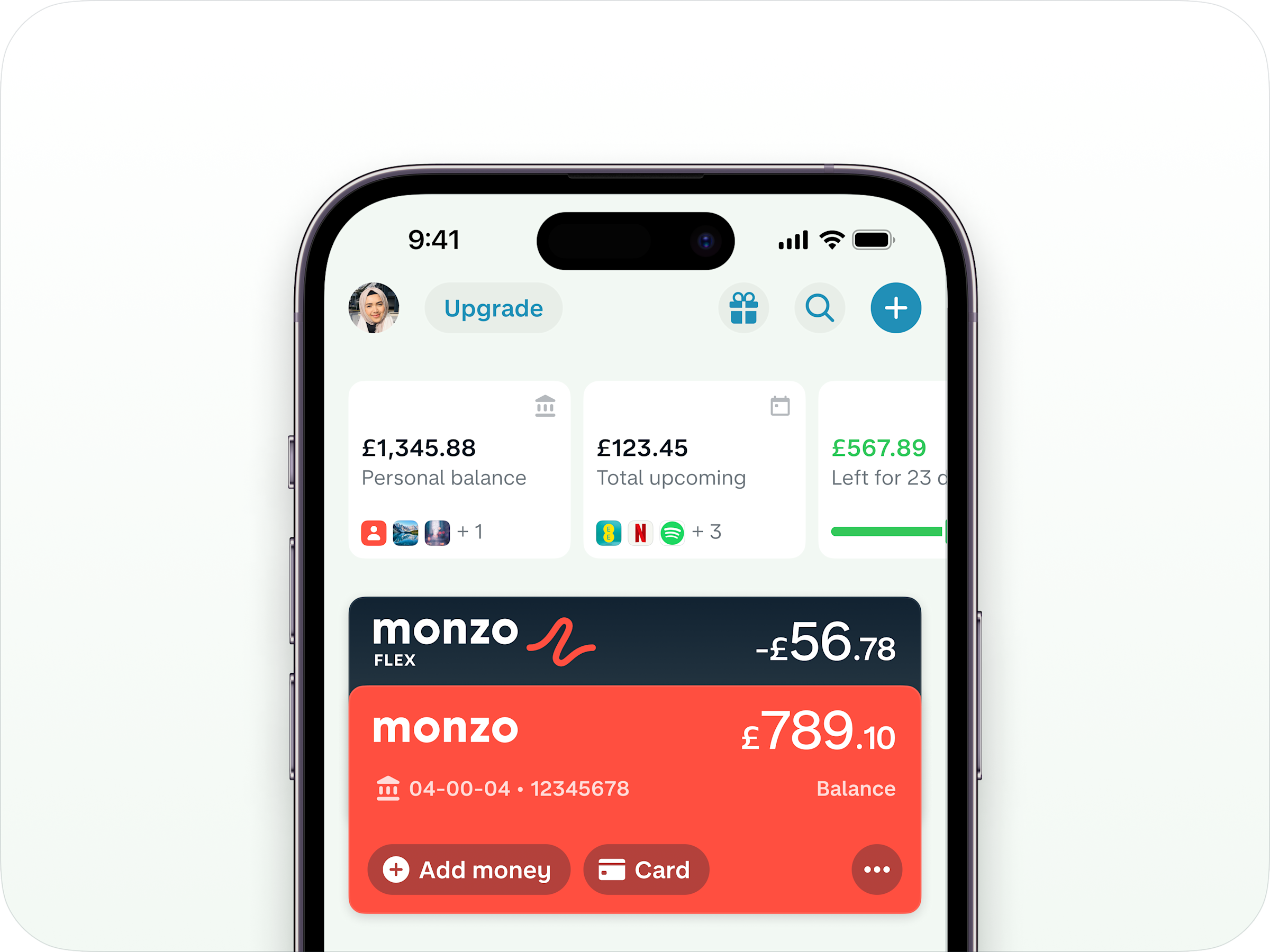
Monzo
Monzo is a UK digital‑only bank that runs almost entirely through its mobile app
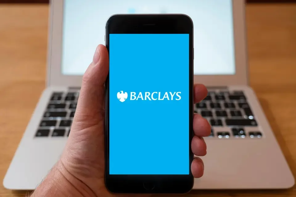
Barclays
Barclays is a major UK high‑street bank with a long-established branch network and a widely used mobile app
Competitor Comparison
How Revolut, Monzo and Barclays handle the Home, Pay and Cards areas of their mobile apps, used as a benchmark for the HSBC redesign.
| Area | Revolut | Monzo | Barclays |
|---|---|---|---|
| Home screen focus | Balances across accounts and currencies are visible at a glance, with quick entry points into analytics and actions. | Feed style view with current balance and recent transactions front and centre, framed as everyday spending view. | More traditional list of accounts and balances with shortcuts into key services, less emphasis on visual analytics. |
| Home information density | Dense but structured: multiple cards, spaces and widgets packed into one view, aimed at power users. | Simpler, lighter layout with fewer widgets and a stronger single column flow that feels easier to scan. | Conservative layout with a lot of text links and options; can feel busy compared with app‑first challengers. |
| Entry points into Pay | Clear “Transfers” and “Payments” actions on the main navigation and home shortcuts for recent recipients. | Dedicated Payments area in the tab bar plus prominent “Pay” actions from the home feed and contacts. | “Pay & transfer” as a primary navigation item; fewer inline shortcuts from the home screen itself. |
| Pay flow experience | Form driven but fast, supports domestic and international transfers with strong emphasis on currency choice. | Very conversational: uses plain language labels, clear steps and upfront confirmation of who and how much. | Follows a classic online banking pattern with multiple steps and confirmations, reliable but feels heavier. |
| Cards overview | Card hub shows physical and virtual cards, with clear controls for details, limits and extras like single‑use cards. | Single primary card view with clear balance and simple access to common actions such as PIN and replacement. | Card management is integrated into wider account menus, so card specific actions are slightly more buried. |
| Card controls and security | Strong “control centre” feeling: instant freeze, limit changes and region controls handled in real time. | Fast freeze and unfreeze, instant notifications and an emphasis on making fraud controls feel approachable. | Offers freeze and security features but in a more functional menu layout, with less emphasis on experience design. |
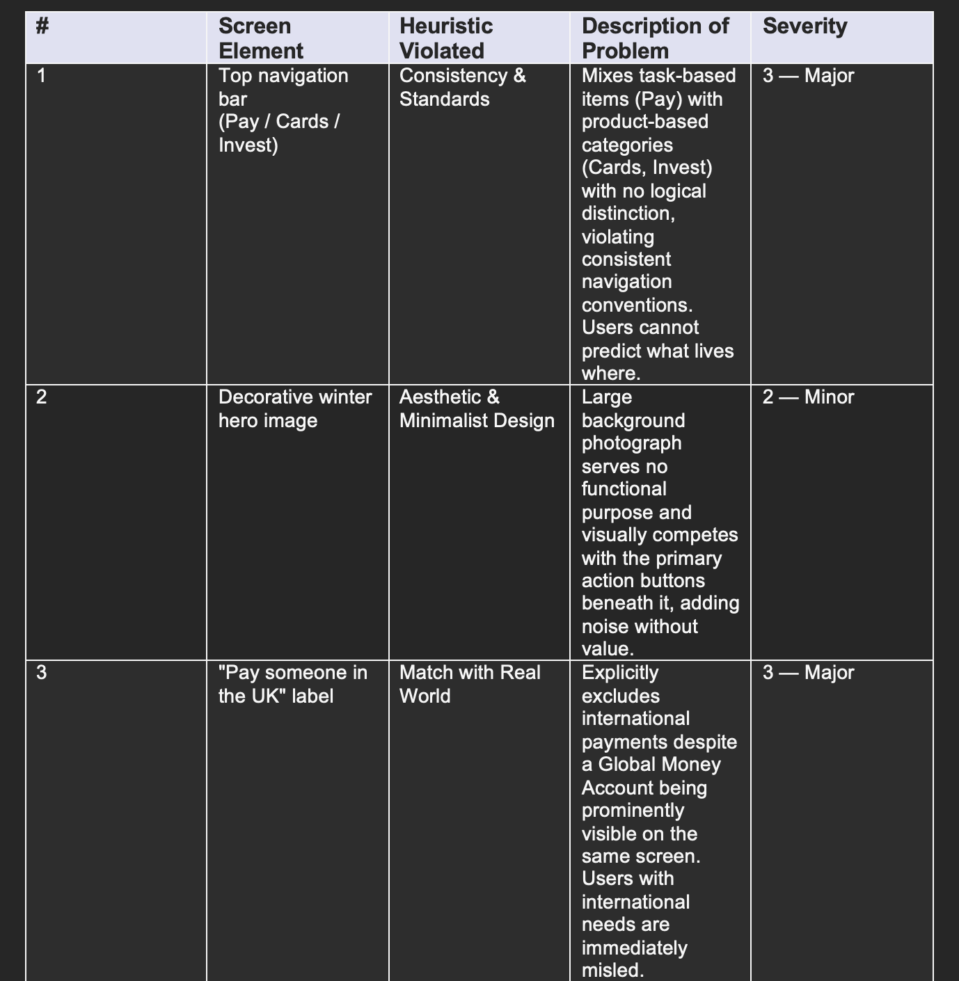
Heuristic Evaluation
Before involving participants, an expert evaluation was conducted against Nielsen's ten usability heuristics. Each violation was assigned a severity rating from 0 (no issue) to 4 (critical failure).
User Testing (Round 1): Current App
Moderated usability testing was conducted with five participants to evaluate the existing app on the same core flows.
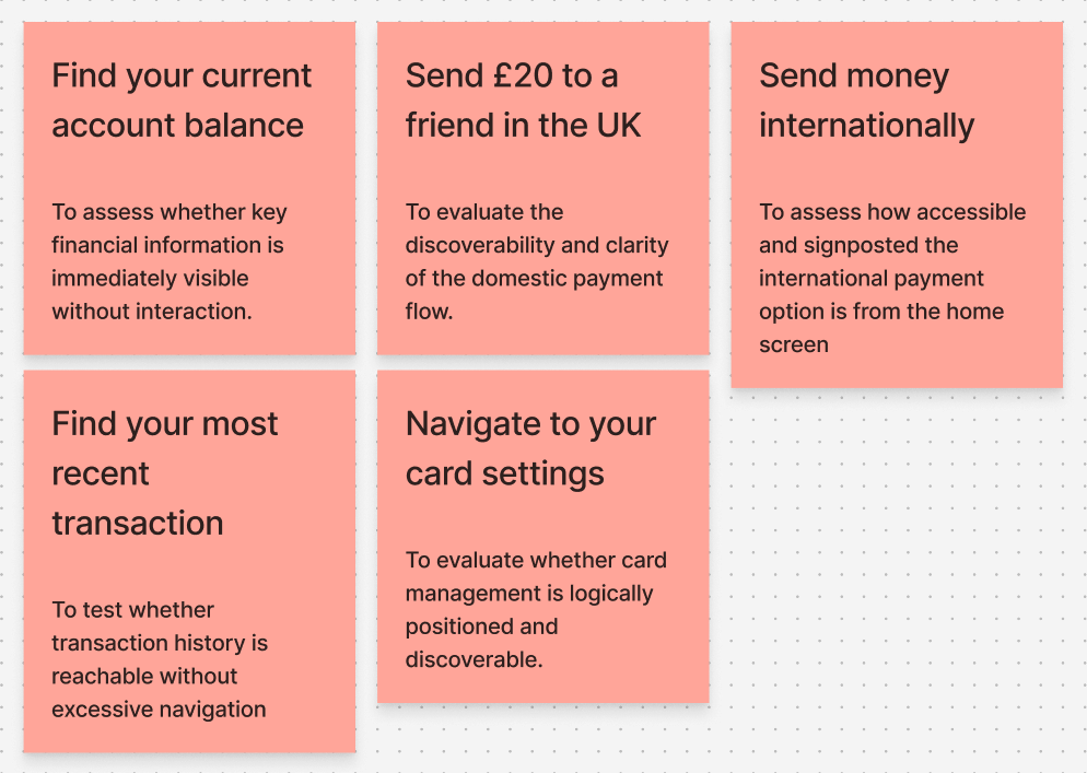
Tasks
Participants completed four scenario-based tasks: finding their current account balance, sending a payment to someone in the UK and internationally, finding their most recent transaction, and navigating to card settings.
Procedure
Each session followed a consistent three-stage structure. Participants completed the tasks while thinking aloud, then filled in the SUS questionnaire, and finished with a short four-question post-test interview.
Data Analysis, Results and Recommendations
Four key findings from testing that directly shaped the redesign.
The five participants returned a mean SUS score of 38.0 out of 100, which falls in the "Awful" category according to established benchmarks. Individual scores ranged from 15.0 to 57.5, showing consistently poor usability perceptions across the board.

Key Findings by Task
Find Balance
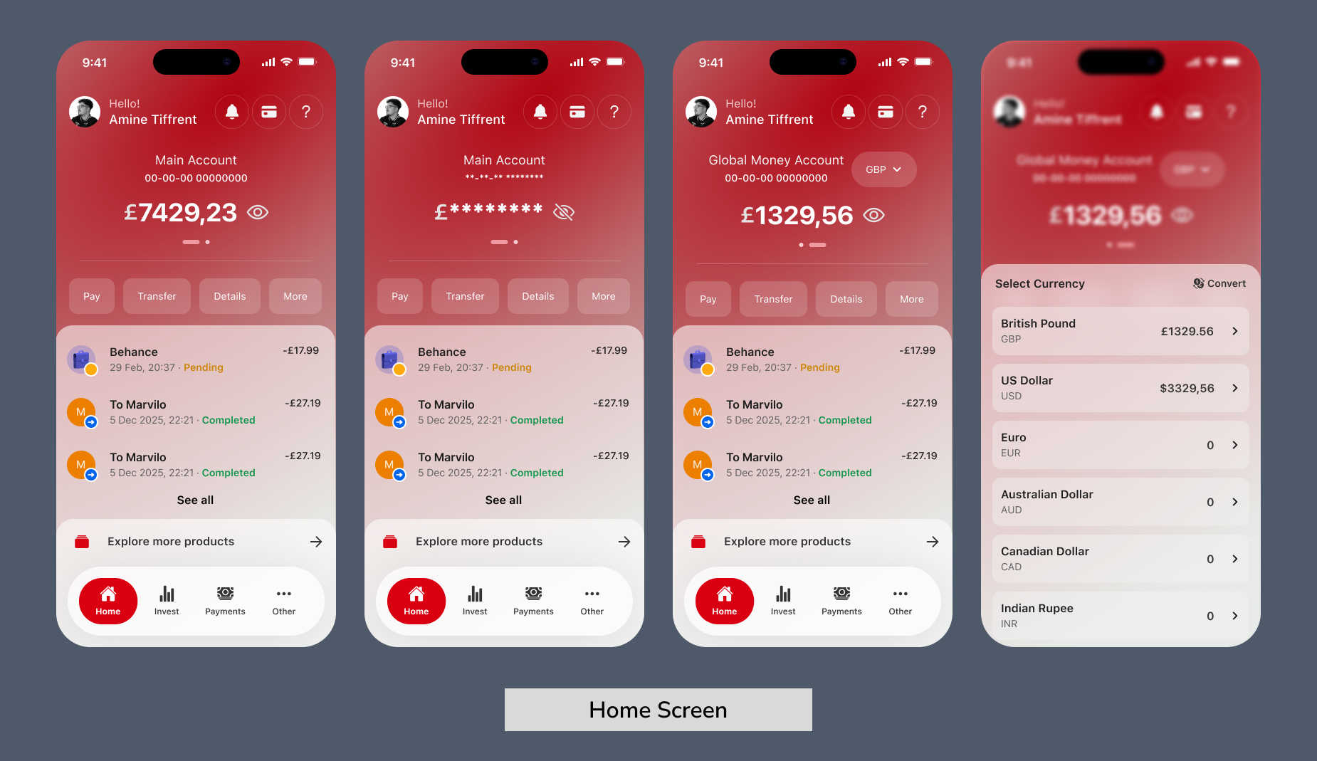
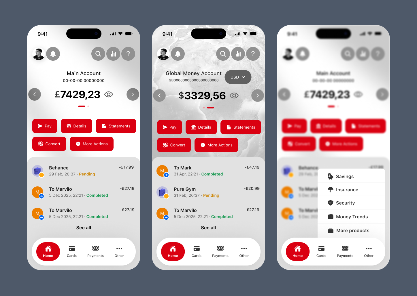
Users were confused by the hidden balance alongside a fully visible account number. The inconsistency felt counterintuitive and made the home screen harder to trust.
Send a Payment
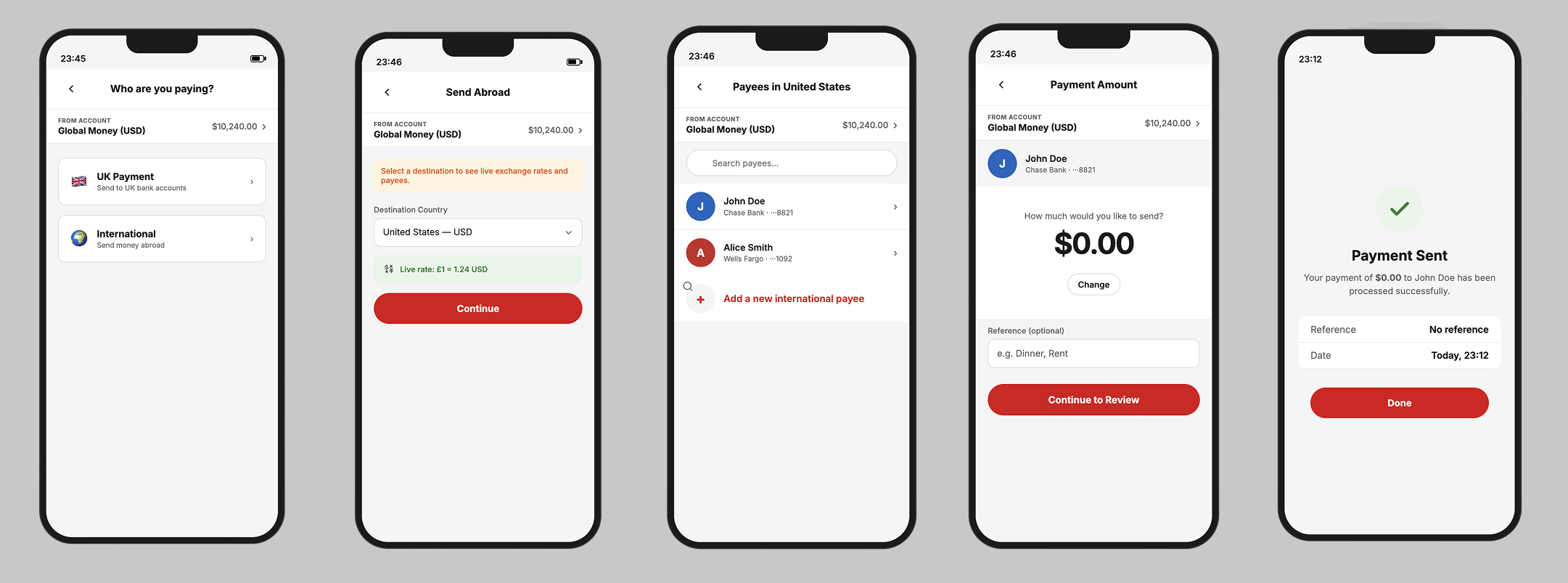
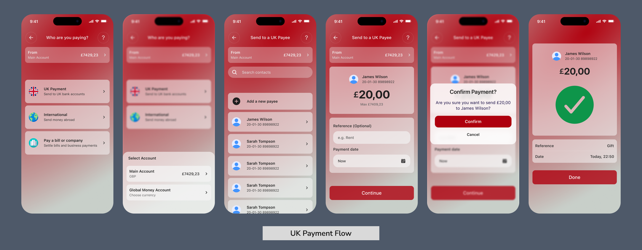
The "Pay someone in the UK" label misled users who needed to send money internationally, despite a Global Money Account being visible on the same screen.
Find Recent Transaction
Users had to navigate away from the home screen entirely to find any transaction activity. There was no financial snapshot visible at a glance, which caused visible frustration.
Card Settings
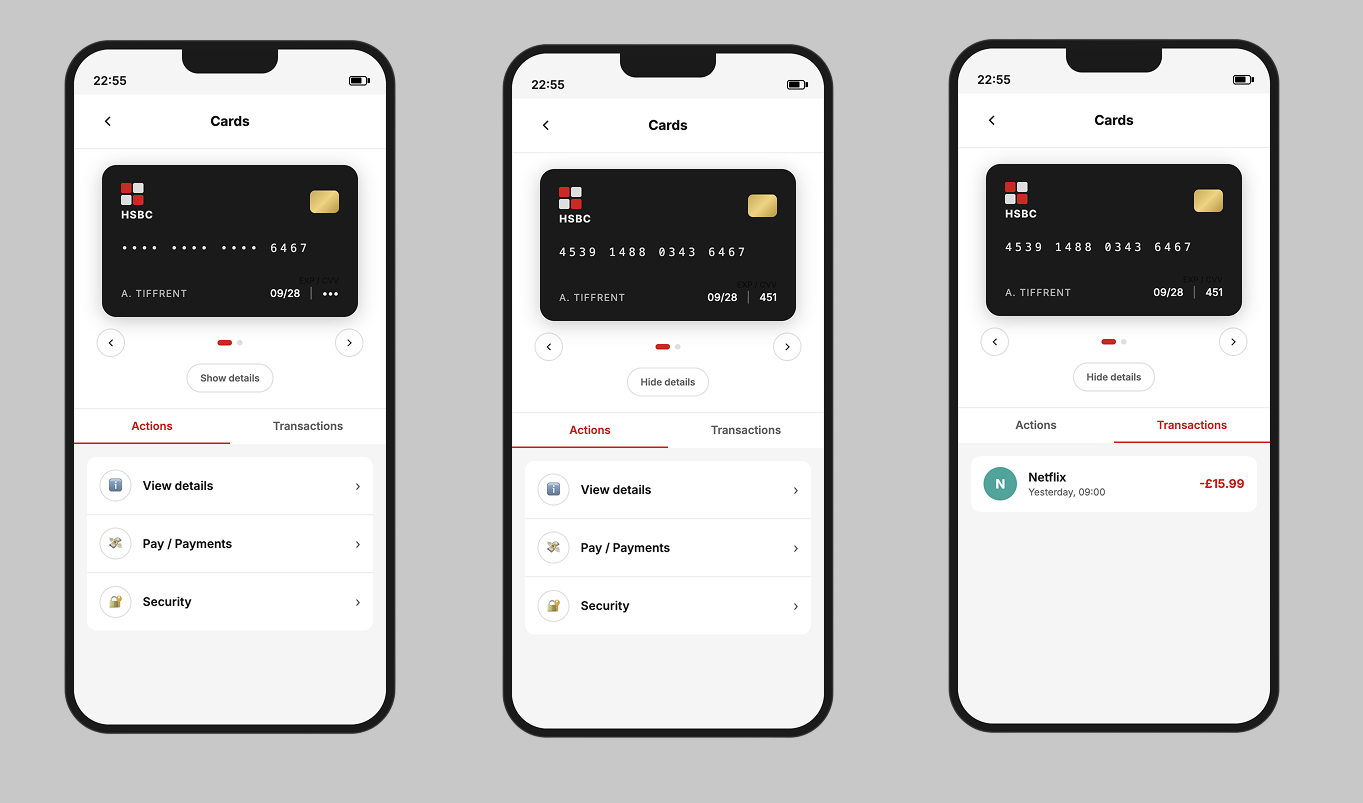
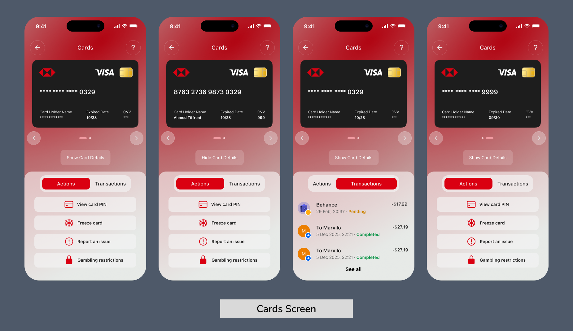
Unlabelled icons and a mixed navigation structure made finding card settings harder than it needed to be. Several participants hesitated or took the wrong path entirely.
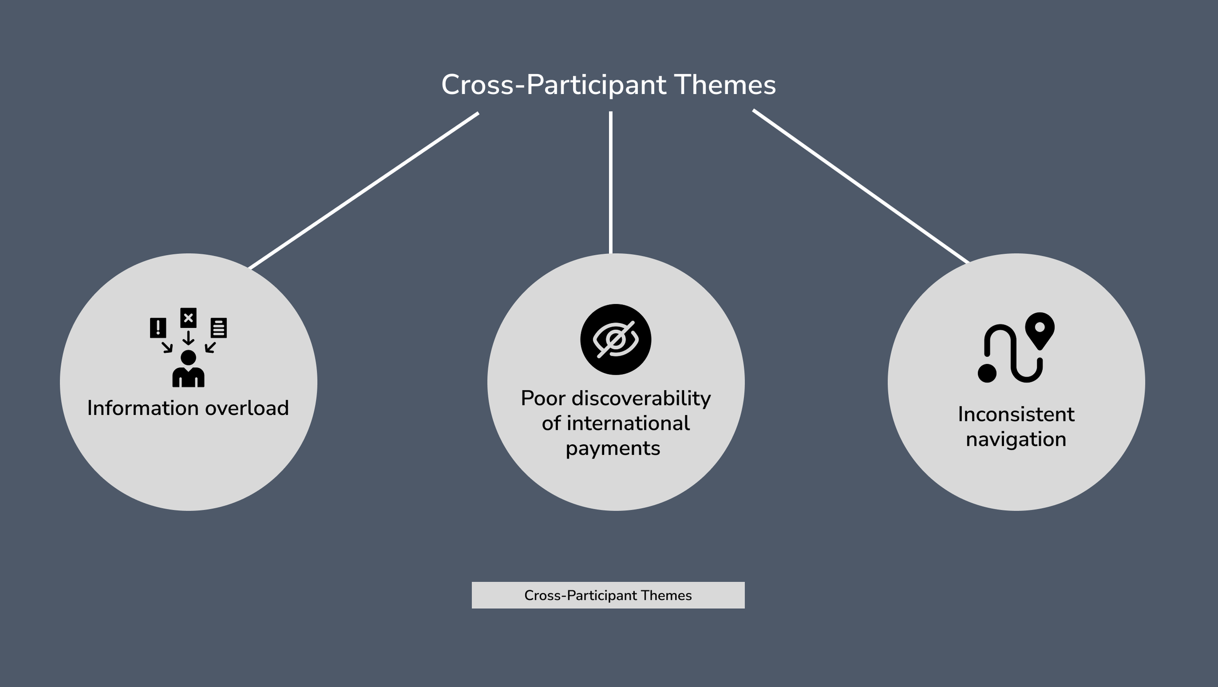
Cross-Participant Themes
Three consistent themes emerged across all five participants: poor information hierarchy on the home screen, confusing navigation labels, and a lack of quick access to frequent tasks.
Design Process
With research and requirements in place, the design phase moved through three progressive stages: from rough sketches to a fully realised, clickable prototype.
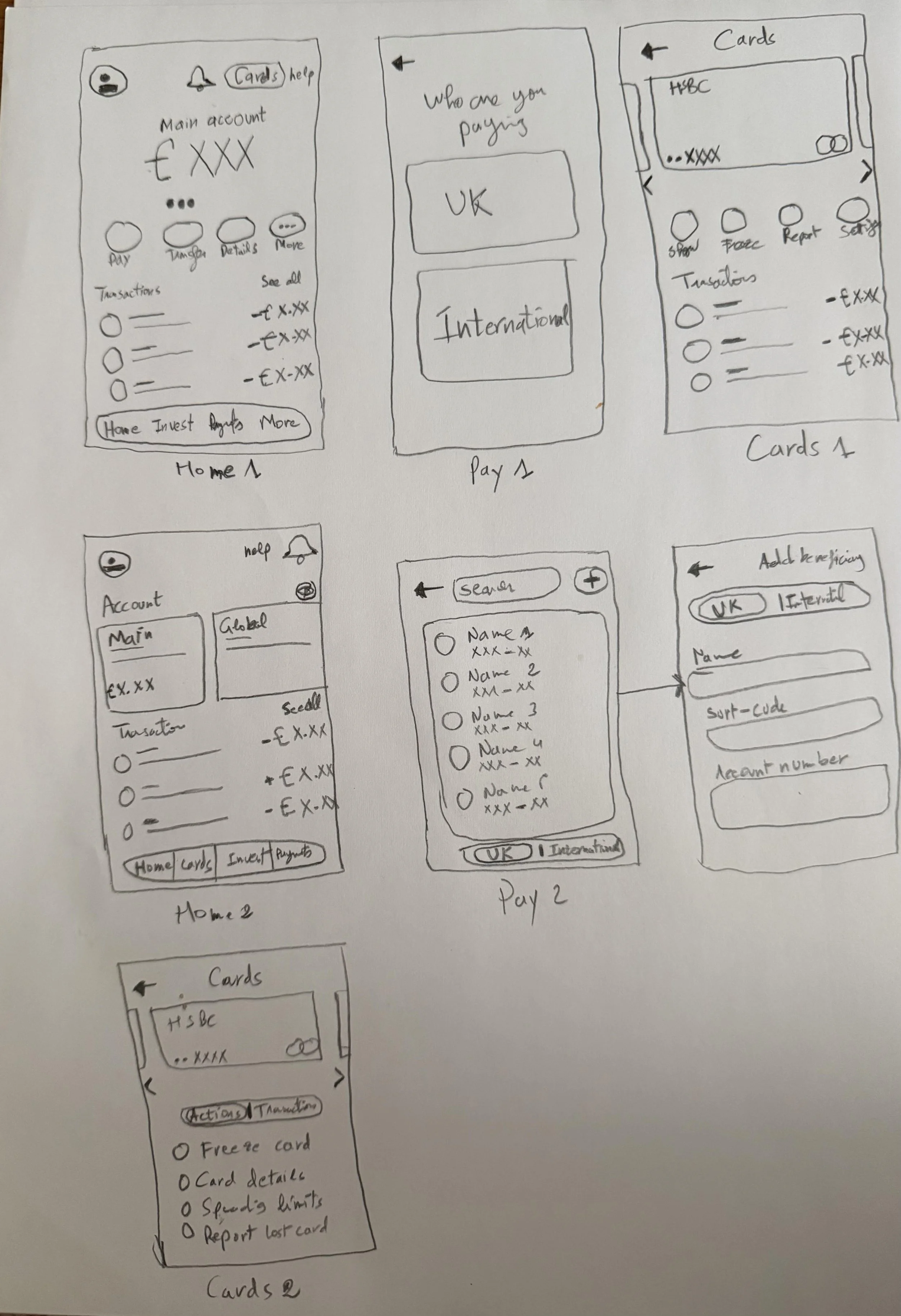
Stage 1 - Sketches (Lo-Fi)
Hand-drawn sketches were used to rapidly explore layout ideas and interaction patterns before any digital work.
Stage 2 - Vibe Coding Prototypes
A complementary clickable prototype was built using vibe coding to simulate real app behaviour and test the flow structure before moving to Figma.
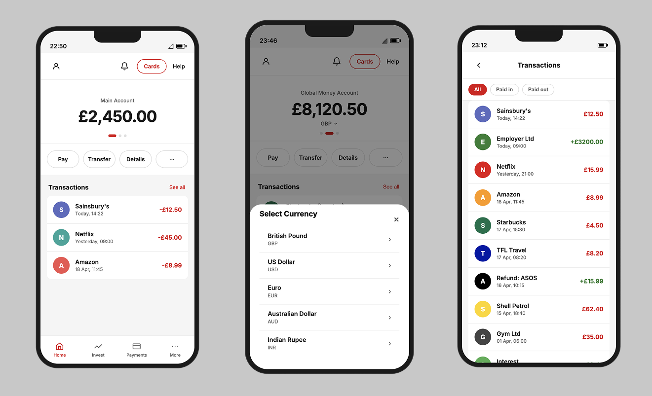
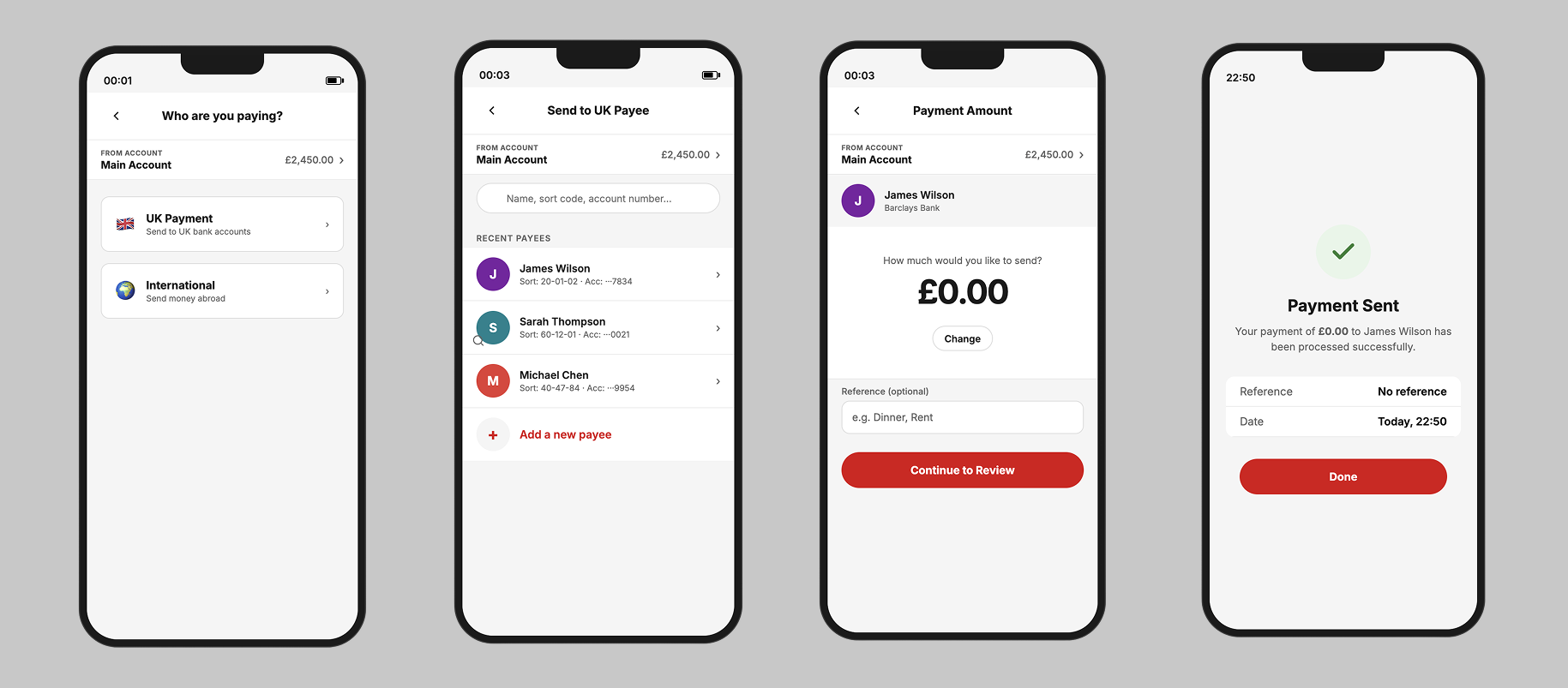
Stage 3 - High-Fidelity Design
The high-fidelity prototype was built in Figma using HSBC's visual identity. Each screen was mapped directly to the usability failures identified during research, keeping the redesign evidence-led throughout.

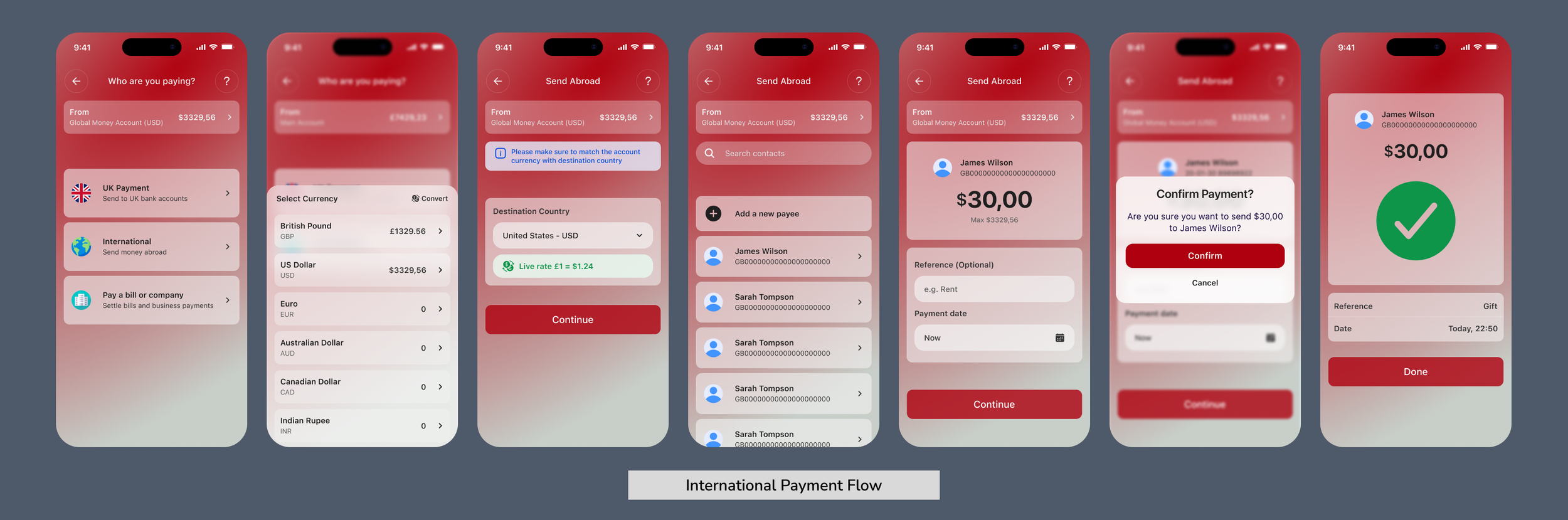
Prototype Testing (Round 2)
Participants completed a second round of testing using the redesigned Figma prototype.
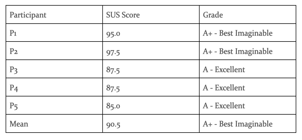
The five participants returned a mean SUS score of 90.5 out of 100, which falls in the "Best Imaginable" category according to established benchmarks. This represented a 52.5 point improvement over the original app's score of 38.0.
Key Findings by Task
Task Performance
All five participants completed every task successfully with no failures recorded. Navigation was described as clearer and more intuitive, and participants moved through key flows with noticeably less hesitation than in Round 1.
SUS Results
The redesigned prototype returned a mean SUS score of 90.5 out of 100, placing it in the "Best Imaginable" category. This represented a 52.5 point improvement over the original app's score of 38.0.
Post-Test Interview Insights
Participants responded positively to the cleaner home screen layout, the clearer payment flow, and the improved card structure. A small number of suggestions were noted for refinement around labelling and visual emphasis on certain actions.
Key Findings and Improvement Areas
The testing confirmed the redesign resolved the main issues identified in Round 1. Remaining areas for improvement were minor and largely related to language choices and secondary action visibility.
Post-Testing Design Iteration
Following Round 2, targeted refinements were made to the prototype based on participant feedback.

Accessibility Audit
Following the design iteration, an accessibility audit was conducted using the Stark plugin in Figma. The audit assessed alignment with WCAG 2.2 Level AA requirements and Apple Human Interface Guidelines for touch target sizing.
Key Findings
The overall usability baseline was strong, with many aspects consistently rated as 0 — no issue — across all four evaluators. However, three recurring problems emerged:
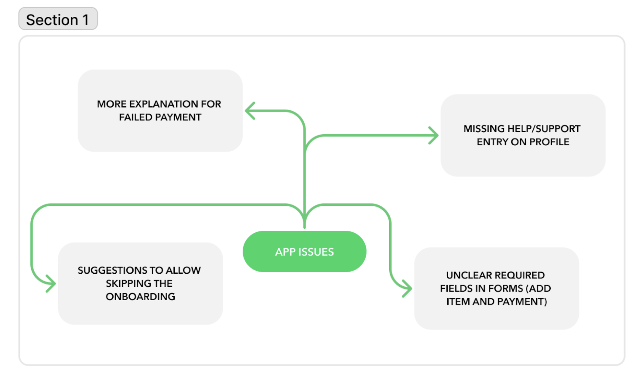
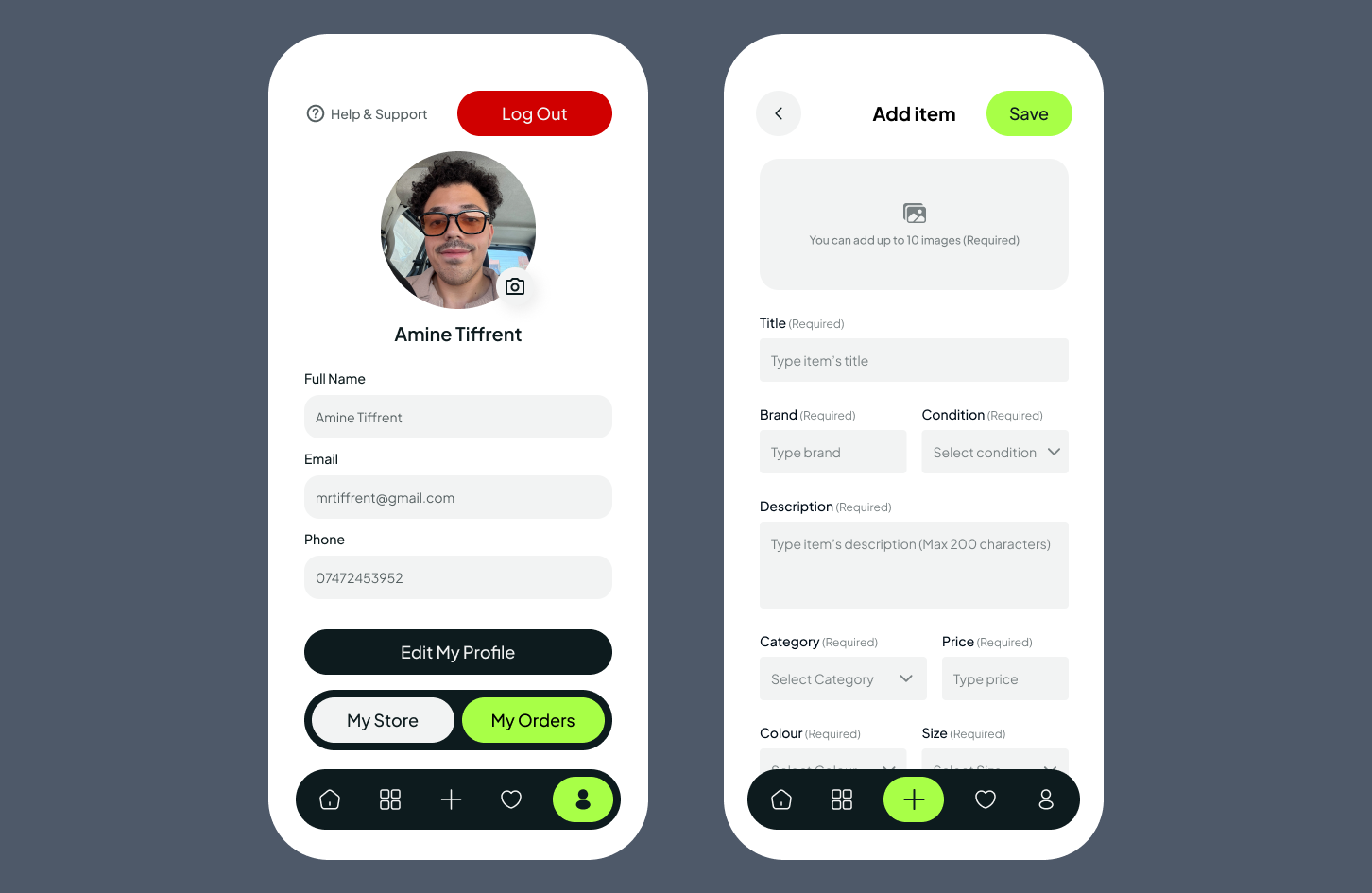
No Help & Support access: Users had no way to access help from within the app, violating the Help and Documentation heuristic
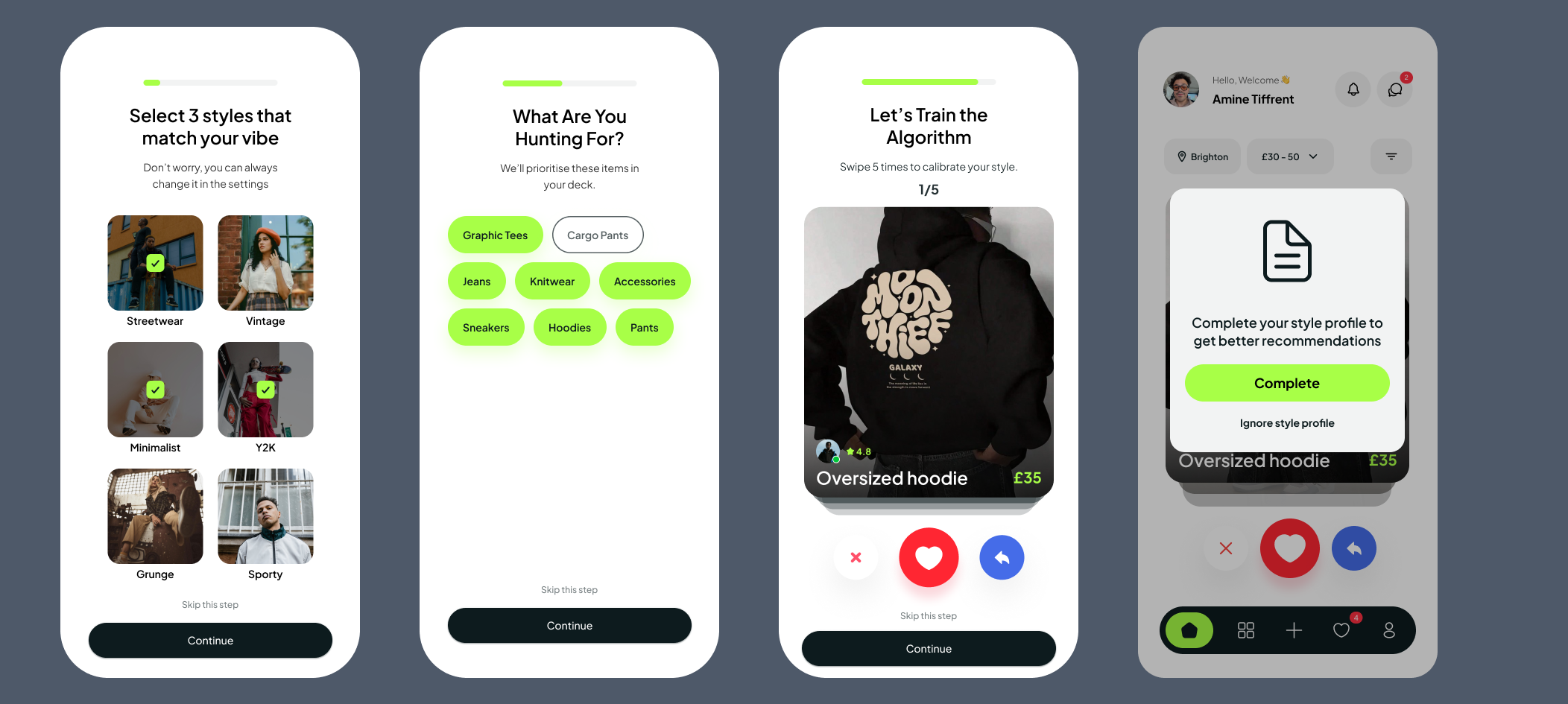
Forced onboarding: No option to skip the style quiz, potentially frustrating users who want to browse immediately
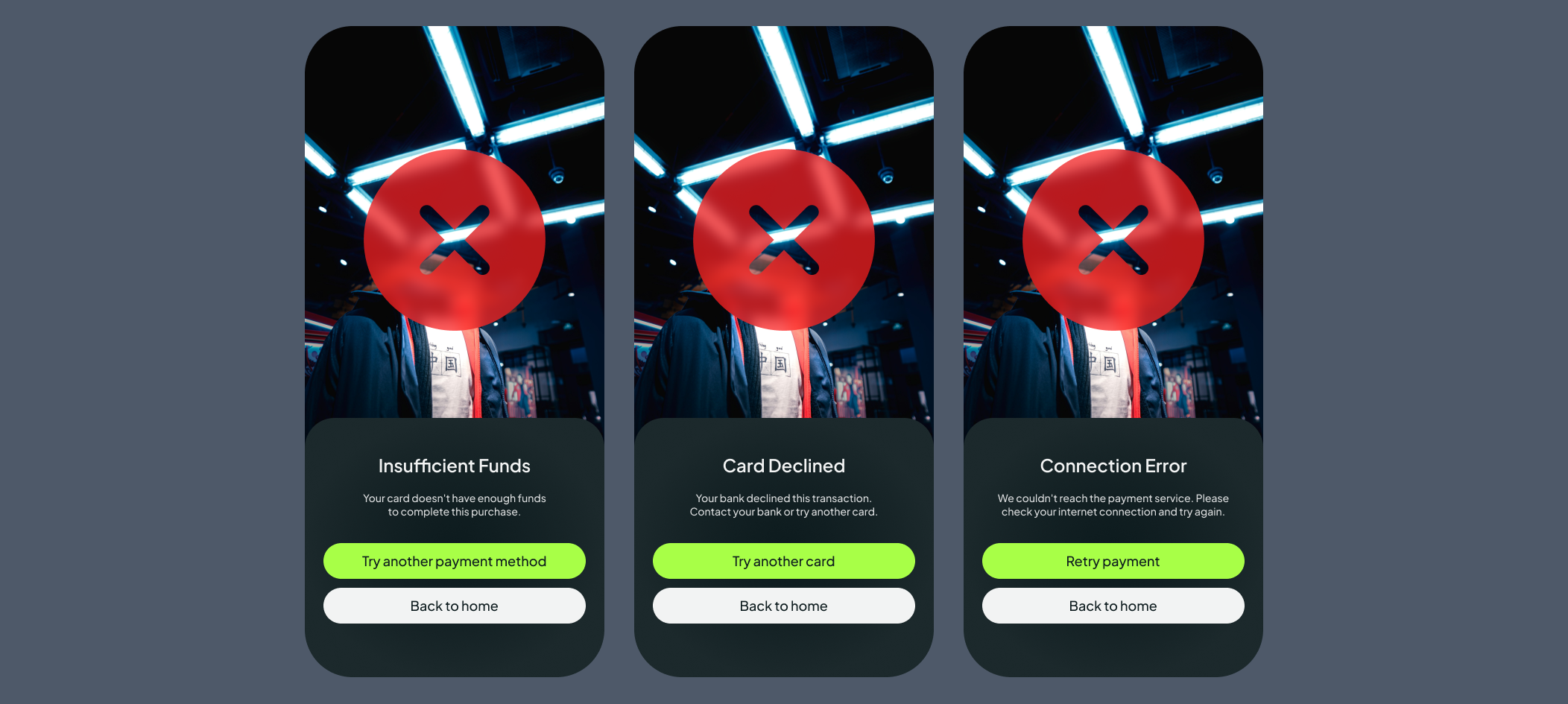
Unclear payment error states: A single generic error screen failed to communicate what had gone wrong or how to resolve it
Unclear required fields: no clear required fields * were marked in adding items and while making payments.
Design Changes Made
Each finding was directly addressed in a revised iteration of the prototype:
Added a Help & Support button to the profile screen header
Added a "Skip this step" option on relevant onboarding screens, and if the users skip many steps, a gentle nudge after their first few swipes — 'Complete your style profile to get better recommendations.'
Created 3 distinct error screens tailored to the most common payment failure scenarios
Added required field indicators on the item listing form
Reflections & Next Steps
Swipe Buy demonstrates that a human-centred process grounded in real research produces a product that genuinely solves a user problem. The swipe mechanic is more than a novelty; it addresses a real emotional gap in the thrift shopping experience, validated by research.
The heuristic evaluation proved particularly valuable. Four independent evaluators surfaced issues that would have been easy to overlook, reinforcing a key lesson: expert review and user testing are not interchangeable; they complement each other, and both are necessary.
Next Steps
| Timeframe | Recommendation |
|---|---|
| Short-Term | Conduct moderated usability testing with real 18–30 users to validate expert findings against actual behaviour |
| Test the revised onboarding skip flow and payment error screens with participants | |
| Full accessibility audit to ensure WCAG AA compliance across all screens and interaction states | |
| Long-Term | Integrate product analytics to track drop-off points, swipe-to-save conversion, and post-launch purchasing behaviour |
| Establish a continuous evaluation cycle combining expert review, usability testing, A/B testing, and data analysis | |
| Explore deferred social features — sharing liked items and following sellers — once the core experience is stable |
“Amine have done a great job in very short period of time. All my preferences and ideas were put together in perfect way and beautiful website.”
Kateryna Sierova - Photographer


“I am thrilled to share my experience working with an outstanding web designer Amine From the moment I engaged their services, I knew I was in capable hands. Their expertise in web design is unparalleled, and I could not be more pleased with the results.”
Sheikh Adiat - SMMA Agency
“Absolute pleasure working with Amine. Great communication, a driven developer and excellent service delivered consistently.”
Joshua Romao - Agency Owner

CONTACT US
CONTACT US
Have a design project in mind? Send me a message, and I’d be thrilled to discuss it with you! I’m excited about new challenges and look forward to connecting!