
Mobile App
Swipe & Buy: Thrift Shopping App

Project Overview
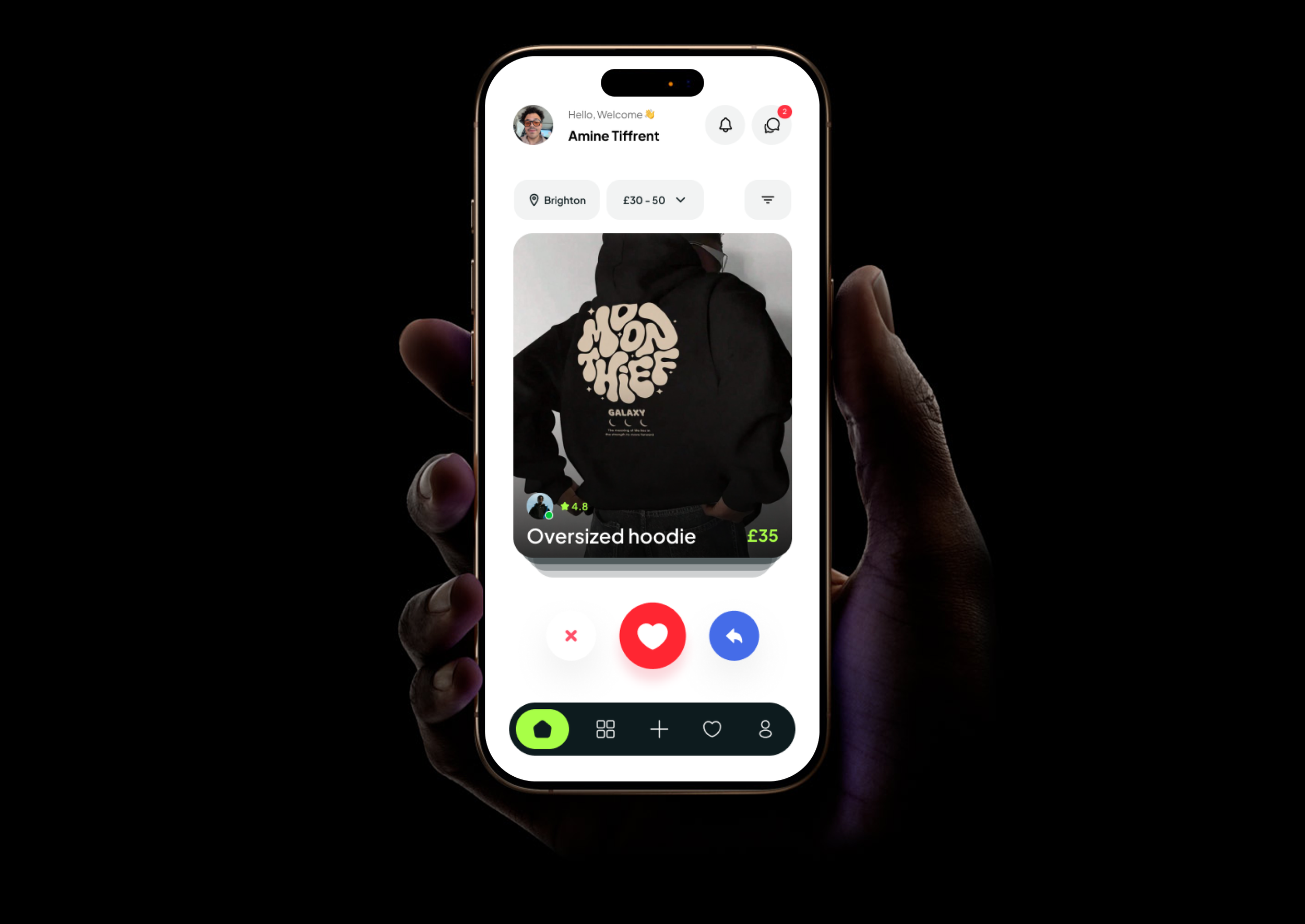
Swipe & Buy is a concept mobile app that reimagines second-hand fashion discovery, replacing cluttered grids with a swipe-based interface where users swipe right to save and left to pass.
The problem: Platforms like Vinted and Depop overwhelm users with dense layouts, turning casual browsing into a chore.
The approach: Applied the full ISO 9241-210 Human-Centred Design process, from user research and wireframing through to high-fidelity prototyping and heuristic evaluation.
Validated by: A participant survey and expert review with independent evaluators.

The Problem


Struggle to filter items without a specific goal in mind
Dense grids, complex filters, and no sense of personality
Users shop to express personal style
Platforms were built for selling, not for discovery.
User Research
The research phase combined a competitor analysis with primary user research to validate the core concept and uncover real user needs before any design decisions were made.
Competitor Analysis
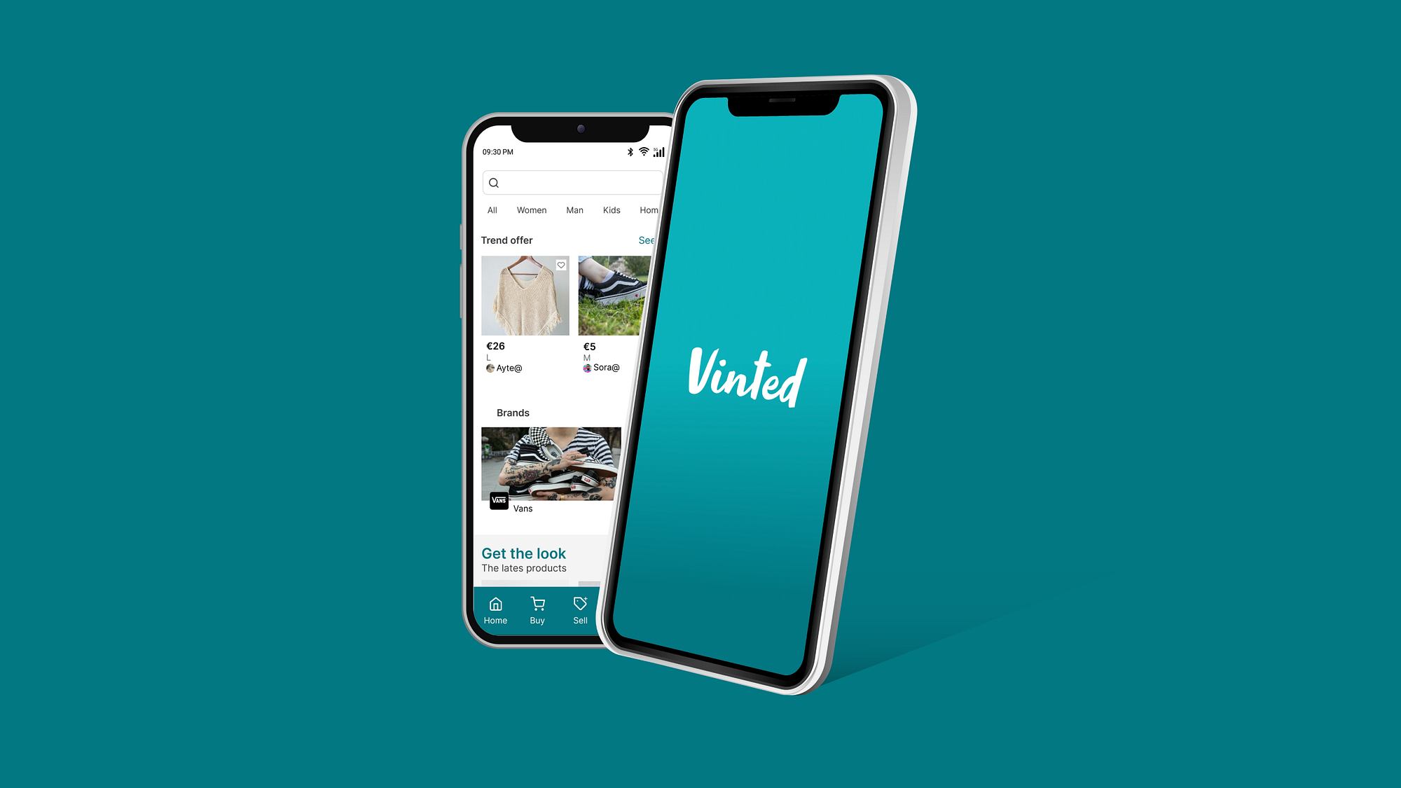
Vinted
A large-scale second-hand fashion marketplace used by 50% of survey respondents
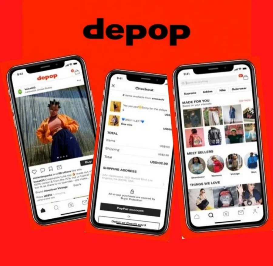
Depop
A visually driven thrift platform popular with younger, trend-conscious shoppers
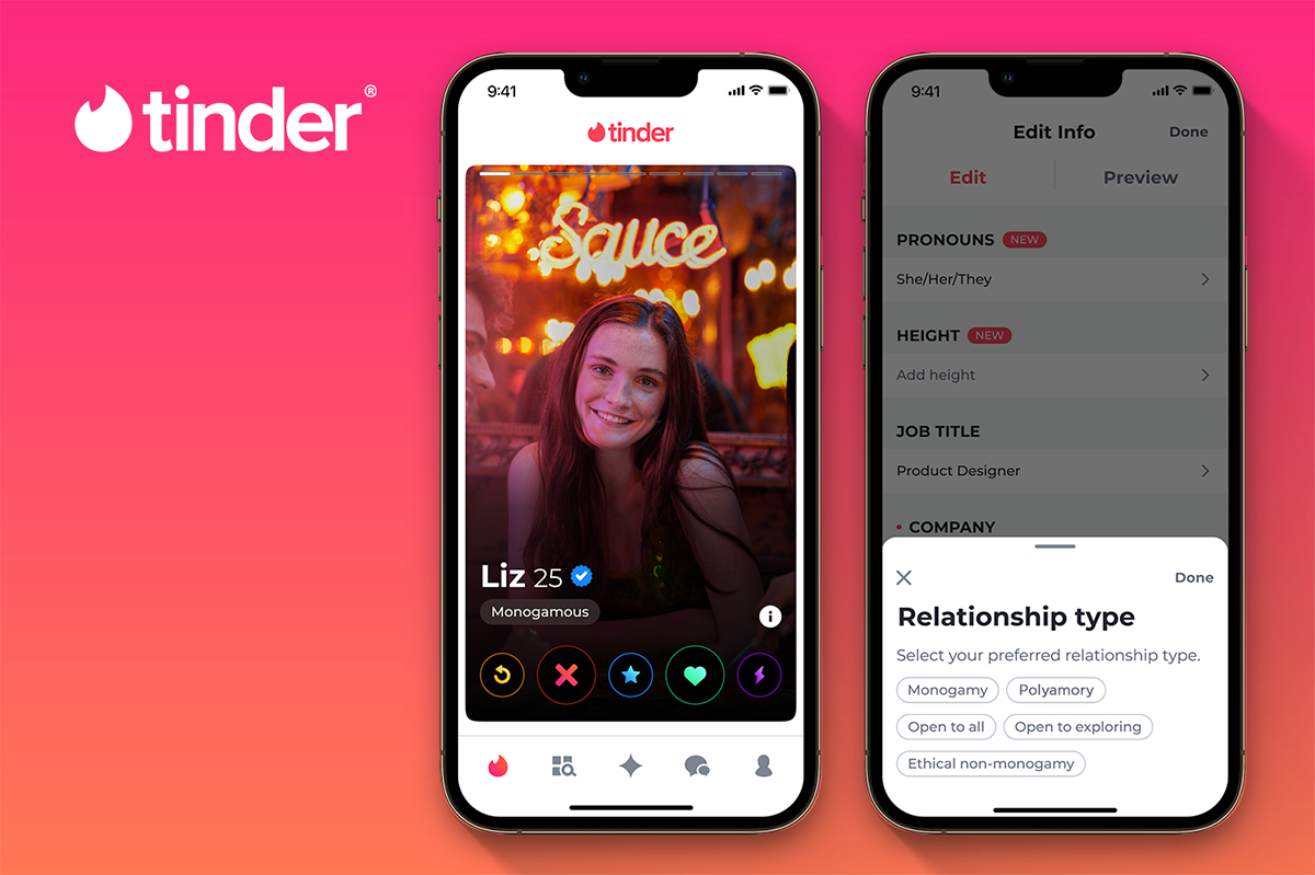
Tinder
Not a shopping app, but the direct interaction inspiration behind Swipe & Buy.
Comparison Table
| Feature | Vinted | Depop | Tinder |
|---|---|---|---|
| Discovery Mechanism | Grid-based feed with search and filters | Same as Vinted in addition to Depop community discover (Inspired by Social media apps) | Card-stack, swipe-based discovery |
| User Interface | Functional, but cluttered with products | Visually driven and trendy | Minimalist, one card at a time |
| User Engagement | Goal-driven browsing only | Socially driven through likes and comments | Highly engaging due to simple, rewarding swipe |
| Onboarding Experience | Straightforward with no style quiz | A short style quiz | Detailed quiz to setup profile and preferences |
| Personalisation | Filter-based, manual effort required | Based on your activity, and following with the ability to filter | Learns preferences through swipe behaviour |
| Emotional Experience | Transactional, task-oriented | Aspirational and community-driven | Fun, playful, and low-effort |
| Decision Fatigue | High, too many items visible at once | Moderate, feed can feel overwhelming | Low, one decision at a time |
User Survey
An anonymous online survey was conducted with 31 participants from the target demographic to discover real user needs and frustrations.
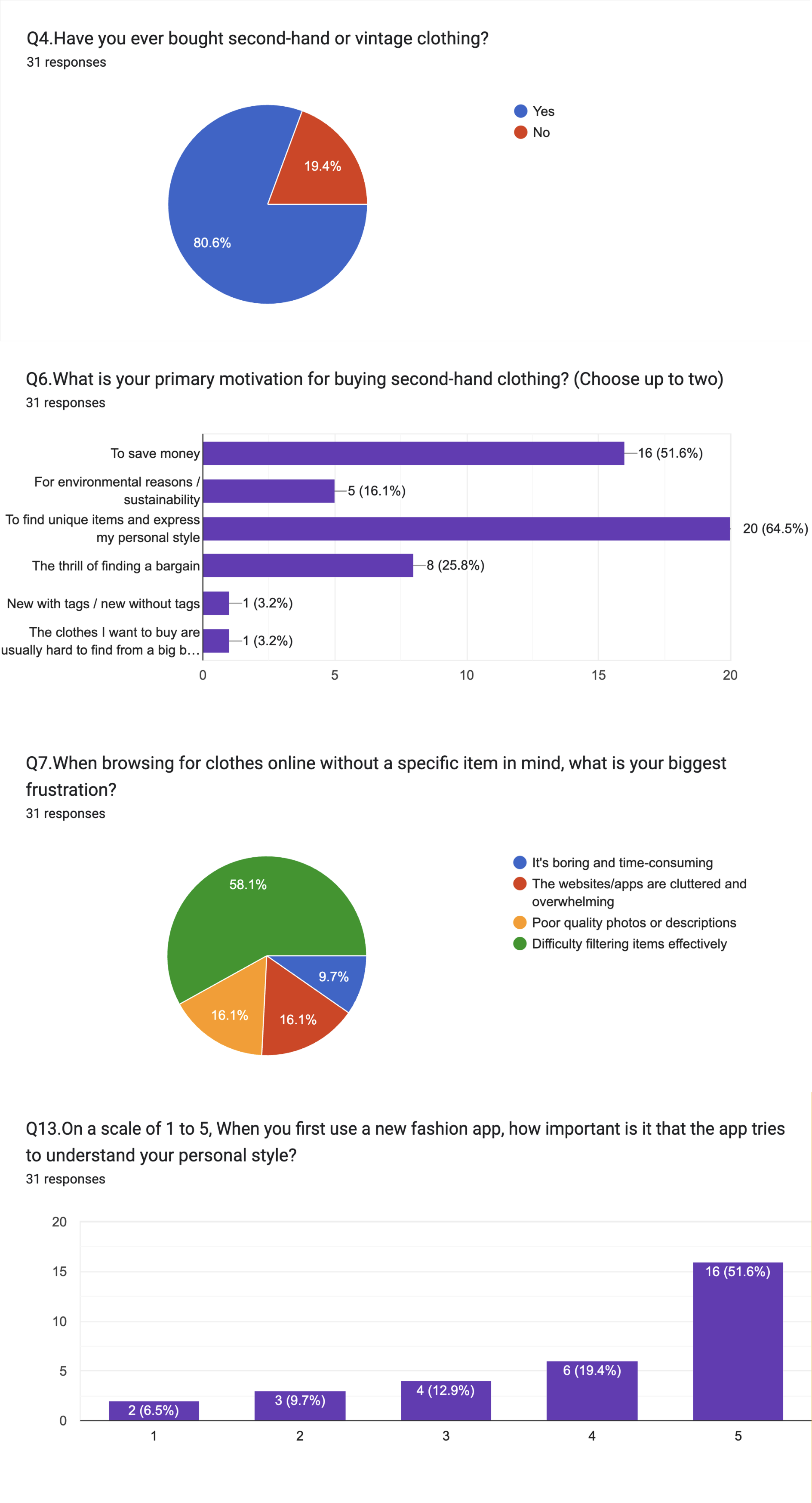
Understanding the Thrift Shopping Experience
Had purchased second-hand clothing before, confirming a large, active market for the app
80.6%
Said their primary motivation was to find unique items and express their style
64.5%
Identified difficulty filtering items effectively as their biggest frustration when browsing without a specific item in mind
58.1%
Responded with 4 or 5 on the importance of the app understanding personal style
71%
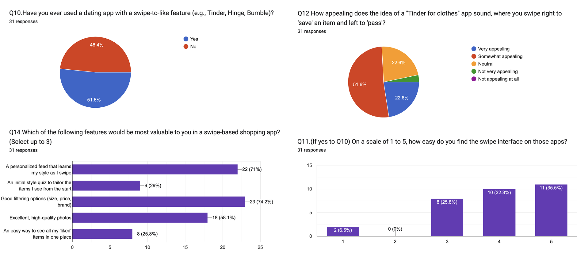
Researching about the swipe concept
Of participants used a dating app with swipe-like mechanism
51.6%
Found the swipe interface easy to use
67.7%
Answered that a personalised feed that learns my style as I swipe is one of the most valuable features
71.0%
Found the "Tinder for clothes" concept “Very” or “Somewhat” appealing
72.4%
Design Insights From Research
Four findings that directly shaped every design decision.
Design for Exploration
Users often browse without a goal. The app needed to remove the need for search and let discovery happen through swiping.
One Item at a Time Reduces Overwhelm
Showing fewer items with more focus lowers decision fatigue and keeps users engaged for longer.
Make Style Feel Personal from the Start
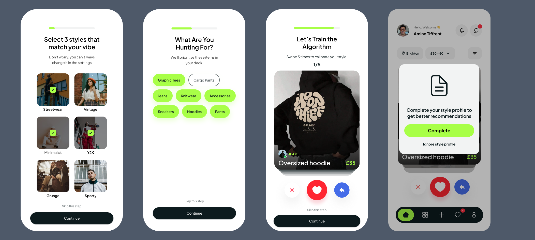
A style quiz at onboarding means the first item a user sees already feels relevant to them.
The importance of filtering
From the style quiz at onboarding, users see items already filtered to their personal taste. Additional filters are embedded seamlessly within the swipe screen itself, no menus, no interruptions.
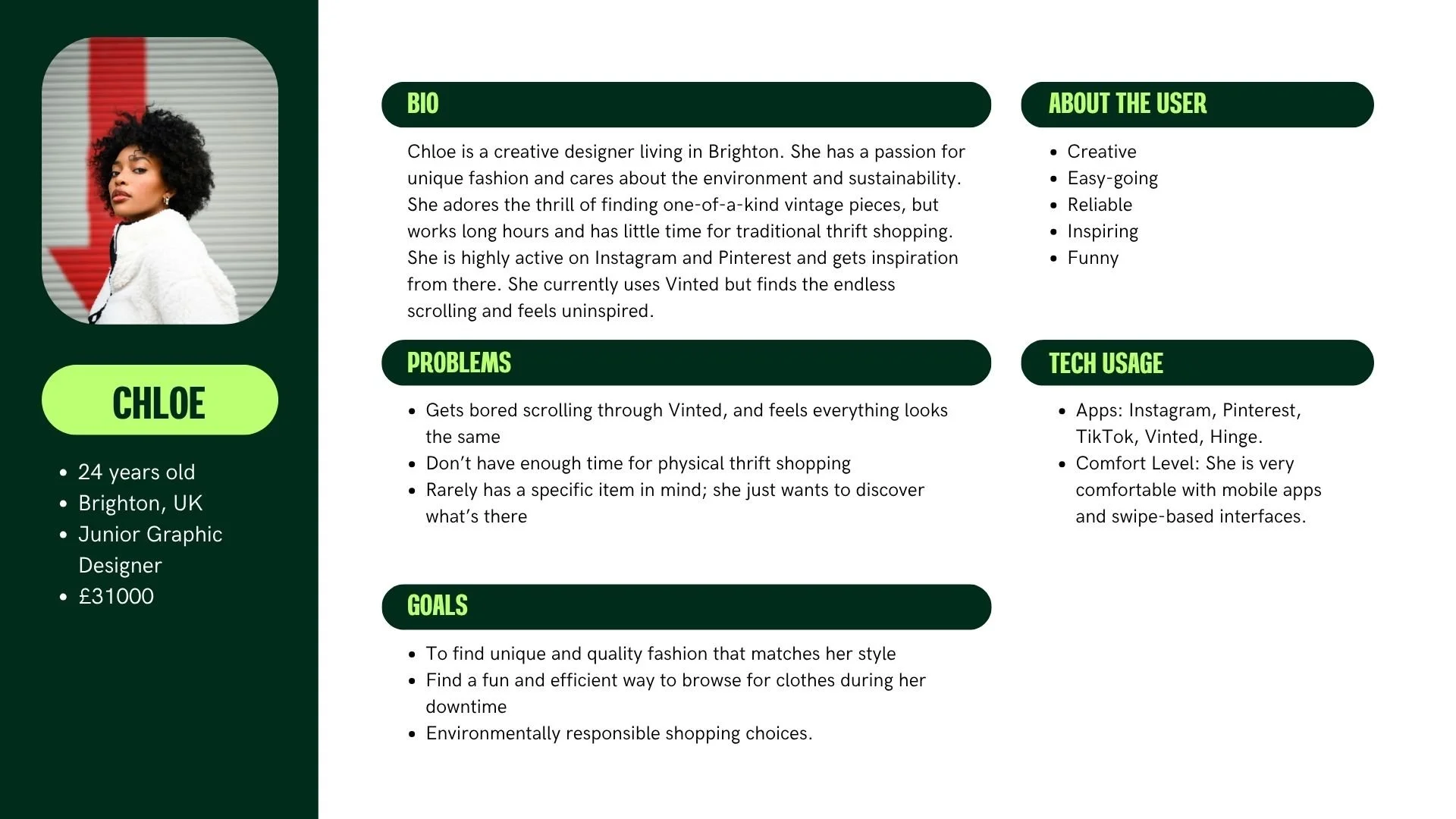
User Profile and Personas
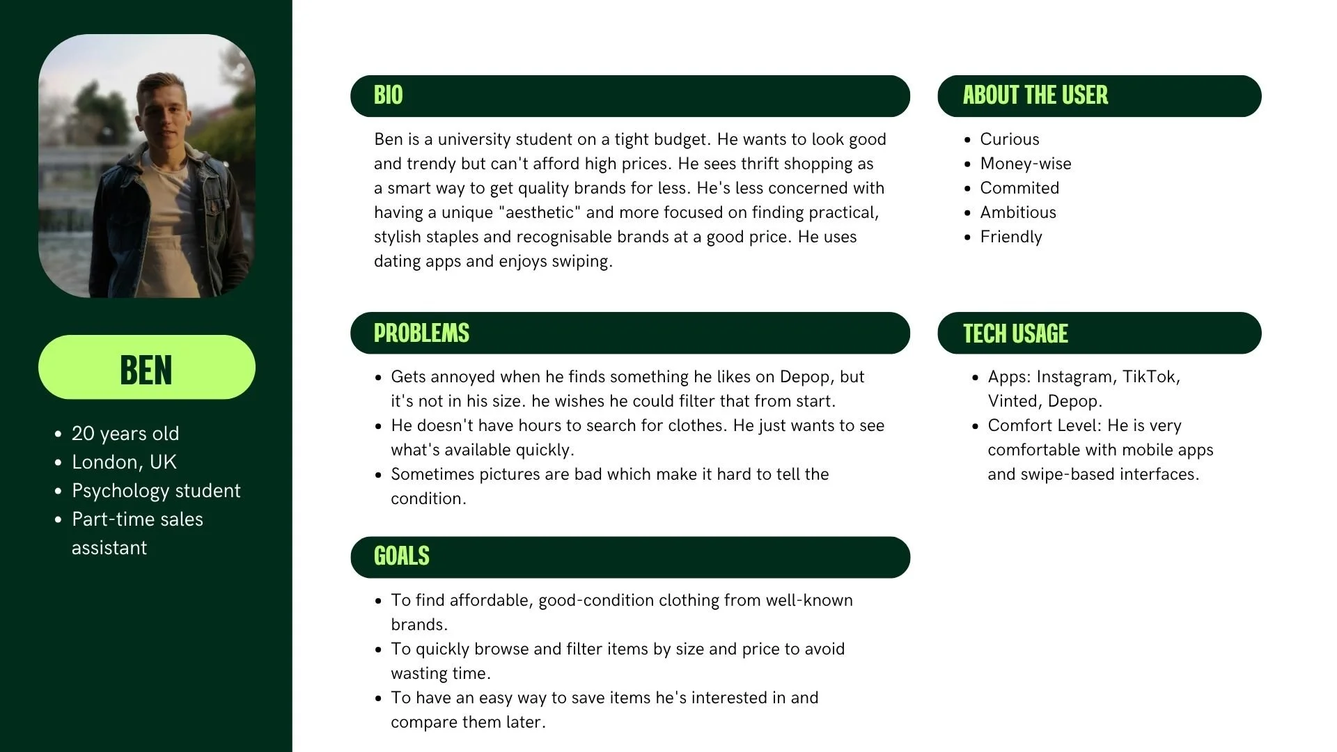
Two personas were then developed to represent the two ends of this audience:
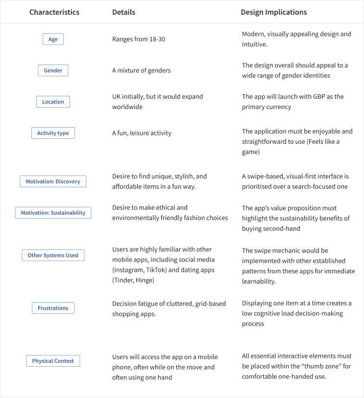
User Profile
The target user is 18–30, UK-based, and smartphone-first. Already highly familiar with mobile apps, the swipe mechanic needs no explanation. They browse for fun, driven by style expression as much as price.
User Personas
Task Models
Two realistic task scenarios were created, one for each persona, to ground the design in concrete, everyday situations:
Chloe's Scenario — On her lunch break, she opens Swipe Buy with no specific item in mind. She simply wants to browse, discover, and save anything that catches her eye by swiping right.
Ben's Scenario — Between university lectures, he needs to find and buy a warm winter jumper from a known brand, within budget, as quickly as possible.
These scenarios ensured every screen and interaction was designed around a real use case, not a hypothetical one.
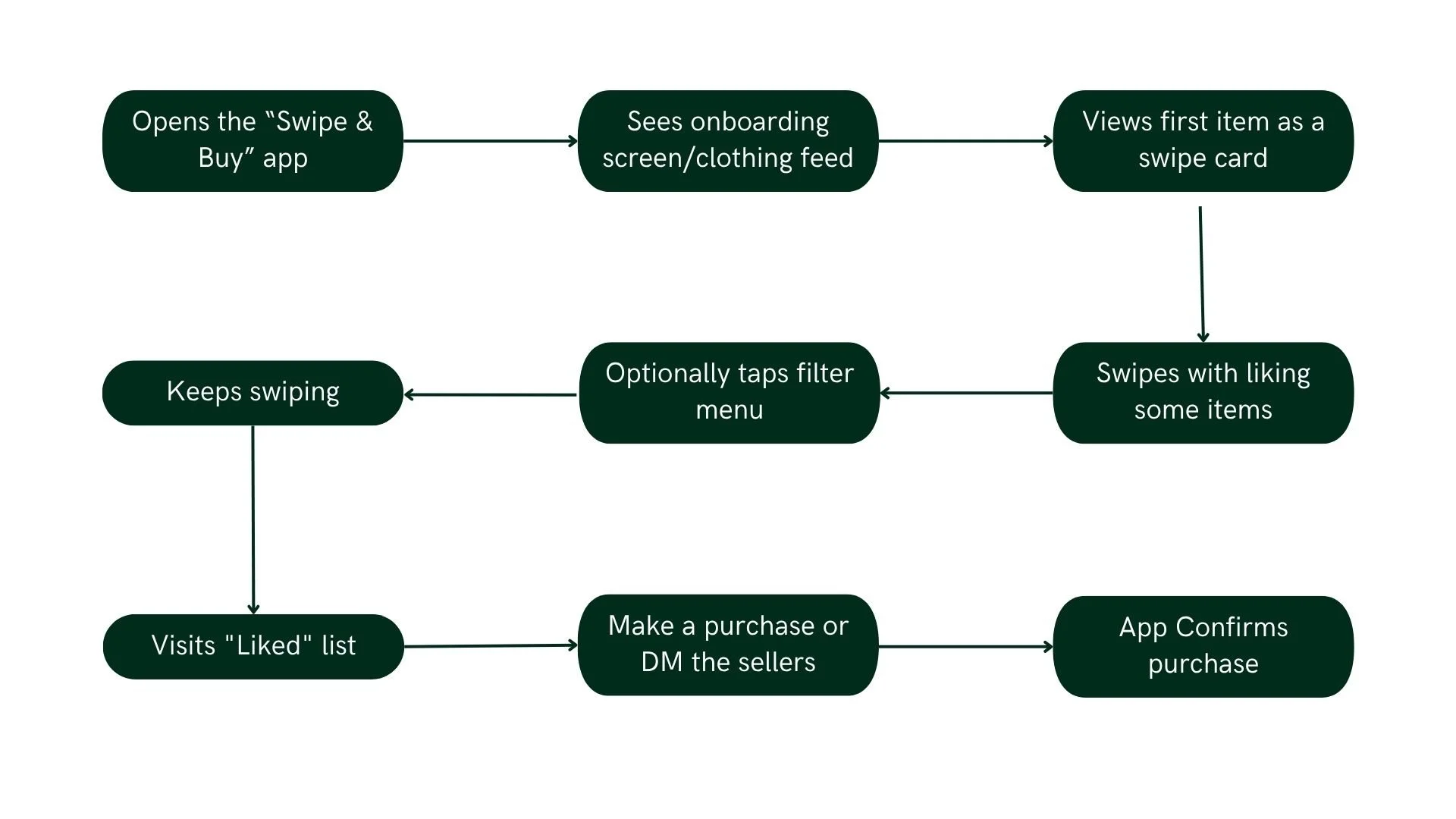
Task Scenario 1 - Chloe
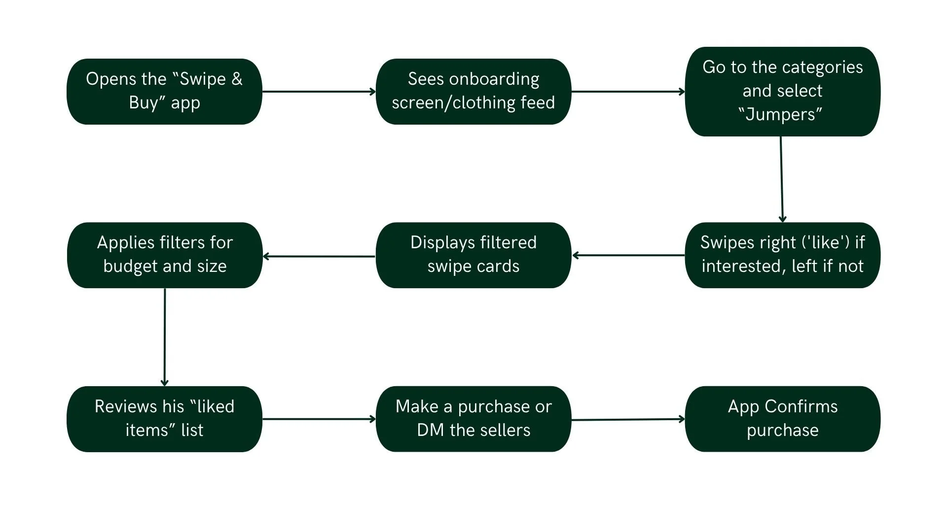
Task Scenario 2 - Ben
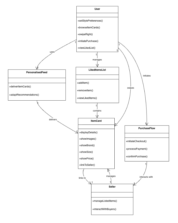
Conceptual Model
The conceptual model maps the main objects in the Swipe Buy system and how they interact with each other
User Requirements
Before moving into design, all requirements were documented across three categories to ensure the final product was both user-centred and technically grounded.
| Type | Category | Requirement | Priority / Rationale |
|---|---|---|---|
| Functional | Onboarding | Style quiz on first launch to capture preferences and personalise the feed | Must Have |
| Browsing | Items presented one at a time in a card stack to reduce cognitive load | Must Have | |
| Interaction | Swipe right to Like, swipe left to Pass | Must Have | |
| Filtering | Filter by brand, price, and condition without leaving the swipe screen | Must Have | |
| Liked Items | All liked items saved to a dedicated list with availability badge | Must Have | |
| Error Recovery | Undo button to reverse the last swipe | Should Have | |
| Social | Share liked items via social media | Could Have | |
| Commerce | No in-app bidding in MVP to ensure simplicity | Won't Have | |
| Usability | Time to Learn | Users can browse and swipe confidently within their first session | Minimise onboarding friction |
| Speed | Browse 10+ items, apply filters, and save favourites in under 2 minutes | Efficient for quick decisions | |
| Error Rate | Undo available for mis-swipes and mis-taps | Reduce incorrect actions | |
| Retention | Returning users recall swipes, filters, and saved items without help | Ease of re-engagement | |
| Satisfaction | At least 75% of users find swiping and discovery enjoyable | Promotes repeated use | |
| Technical | Physical Context | Fully usable one-handed, with buttons in the natural thumb zone | Users browse while multitasking |
| Visual Context | WCAG AA contrast maintained for legibility in all lighting conditions | Users may be outdoors | |
| Performance | High-resolution product images load in under 1.5 sec | Slow loading breaks the swipe flow | |
| Compatibility | Responsive and functional on iOS and Android | Primary demographic is smartphone-first | |
| Reliability | Offline caching for at least 10 swipe cards to handle signal loss | Seamless experience for commuters |
Information Architecture
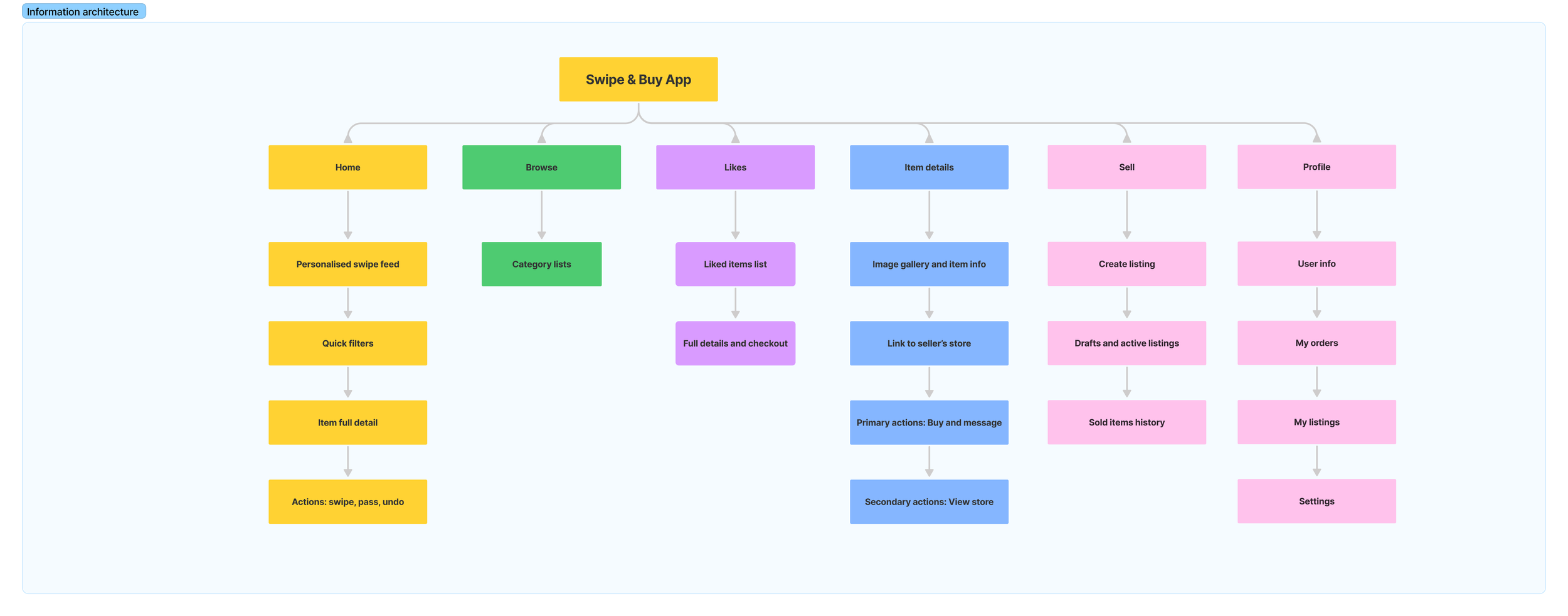
The Information Architecture maps every screen and feature across the app, from onboarding to profile management. Five tab bar sections structure the experience: Home, Browse, Sell, Liked Items, and Profile, keeping everything reachable and intuitive.
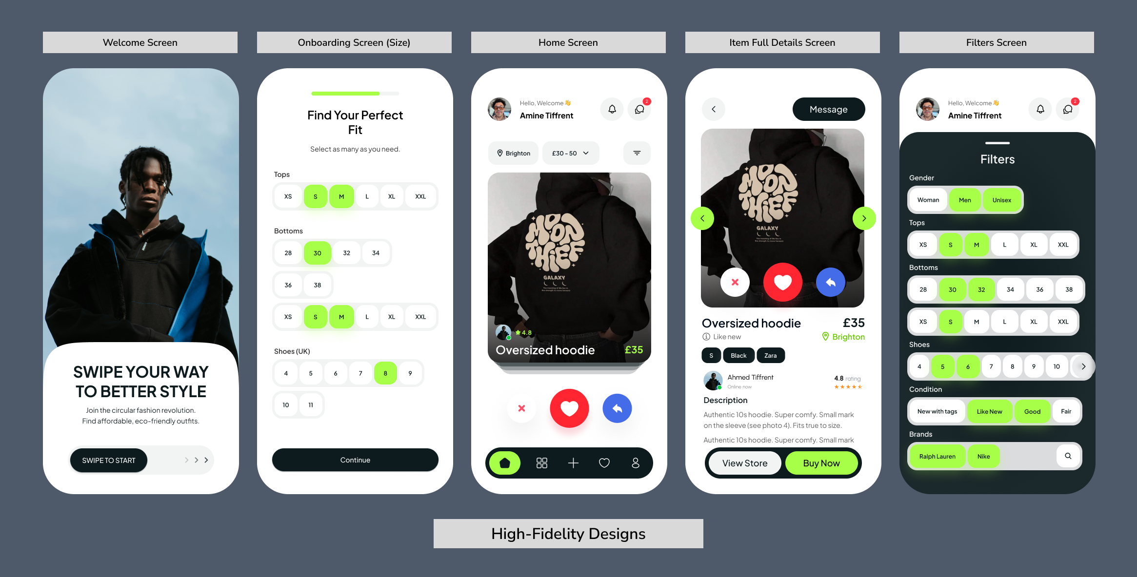
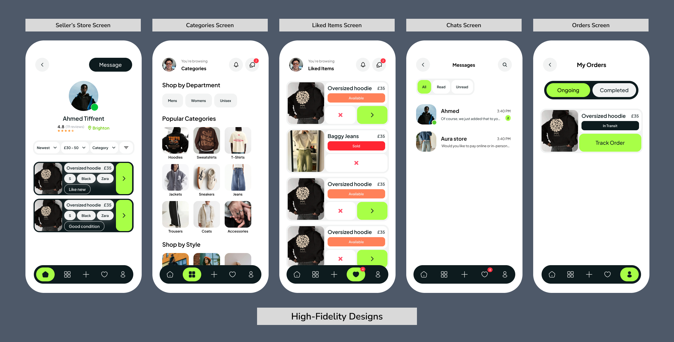
Design Process
With research and requirements in place, the design phase moved through three progressive stages: from rough sketches to a fully realised, clickable prototype.
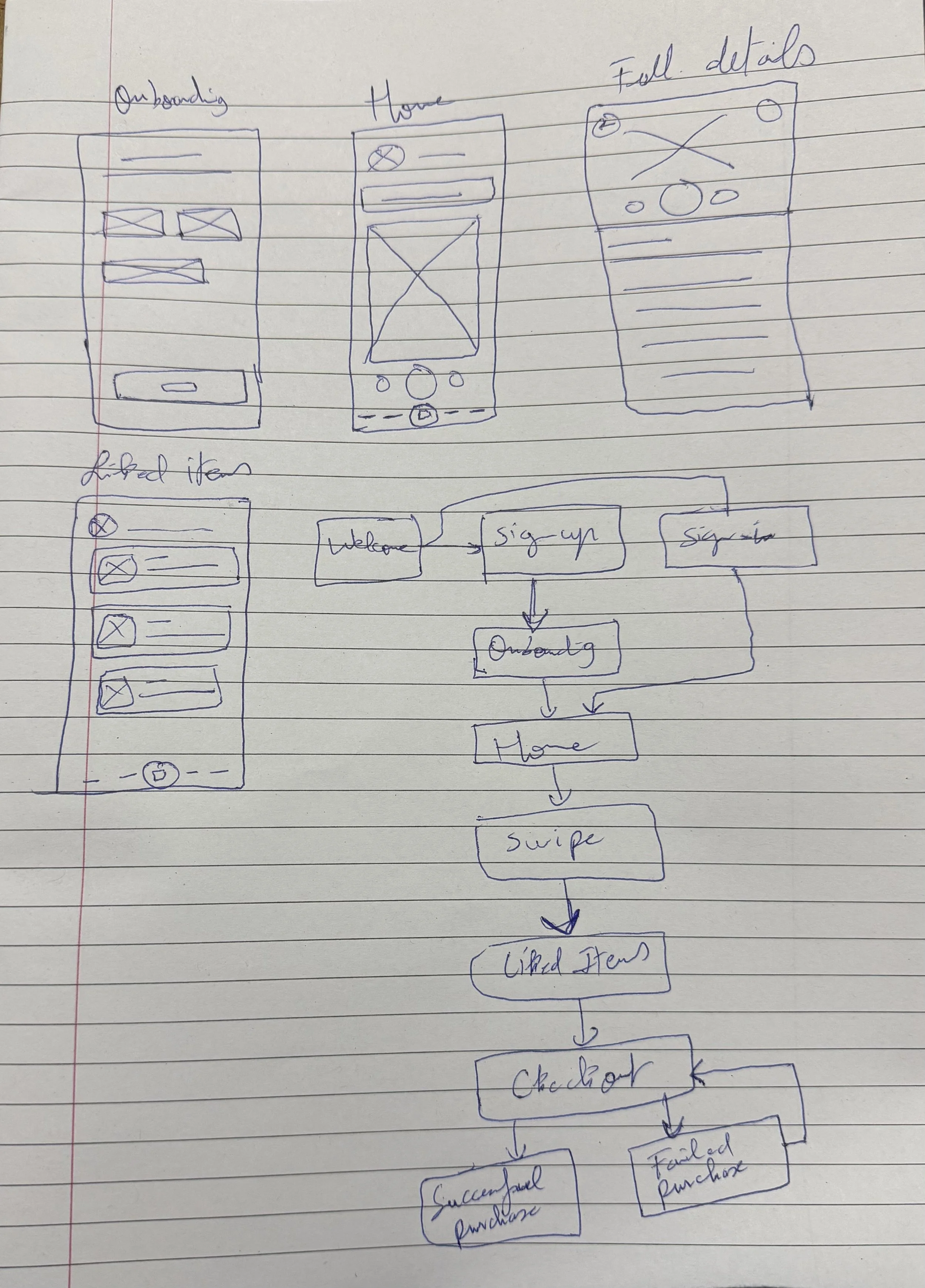
Stage 1 — Sketches (Lo-Fi)
Hand-drawn sketches were used to rapidly explore layout ideas and interaction patterns before any digital work.
Stage 2 — Wireframes (Lo-Fi)
Sketches were then translated into clean digital wireframes for all key screens. Each screen was designed with a clear, focused purpose
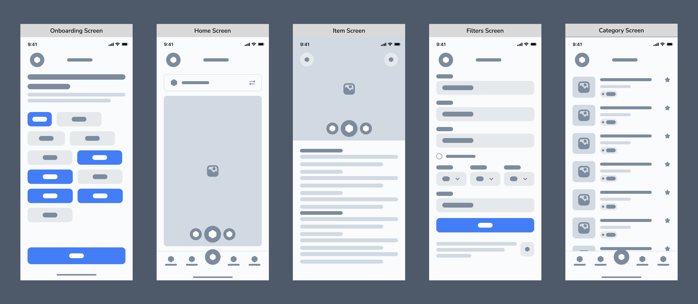
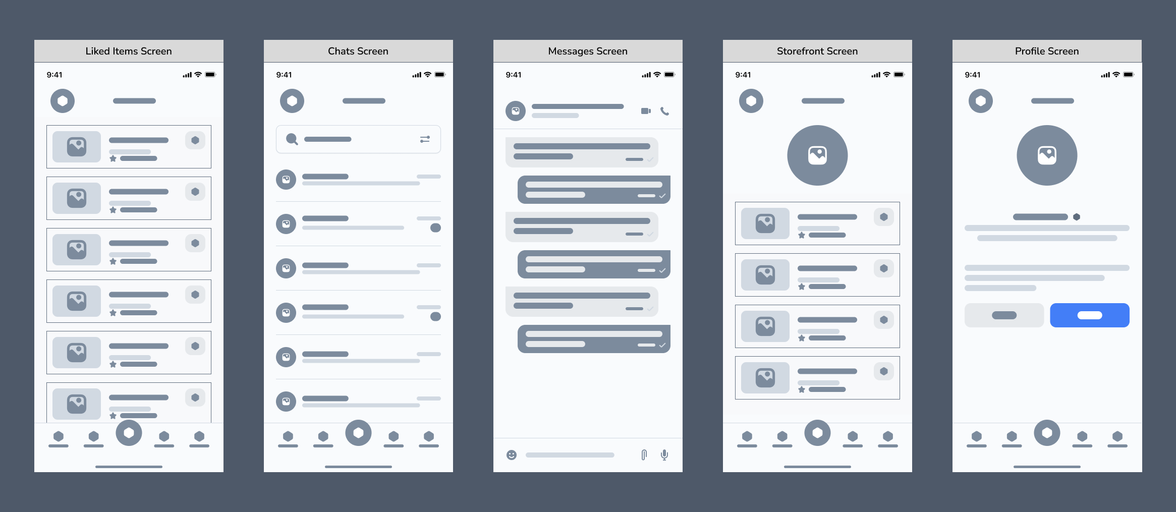
Stage 3 — High-Fidelity Design
Wireframes were brought to life with the full Swipe Buy visual language applied consistently across every screen.
Two key principles shaped the layout decisions throughout: Hick's Law, limiting actions per screen to reduce decision fatigue, and Fitts' Law, keeping core interactions large and within thumb reach.
The result is a high-fidelity Figma prototype covering all primary flows, from onboarding and swiping through to selling and checkout.
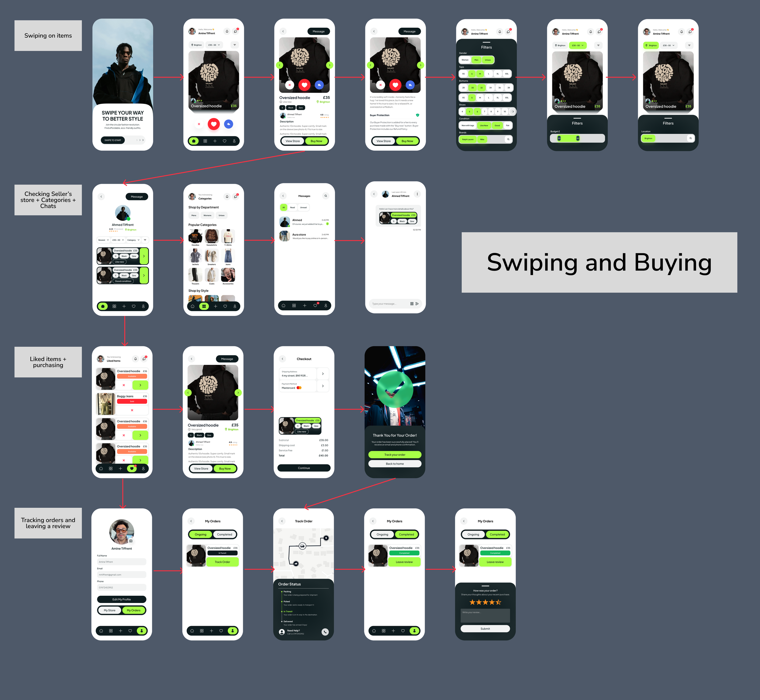
User Flows
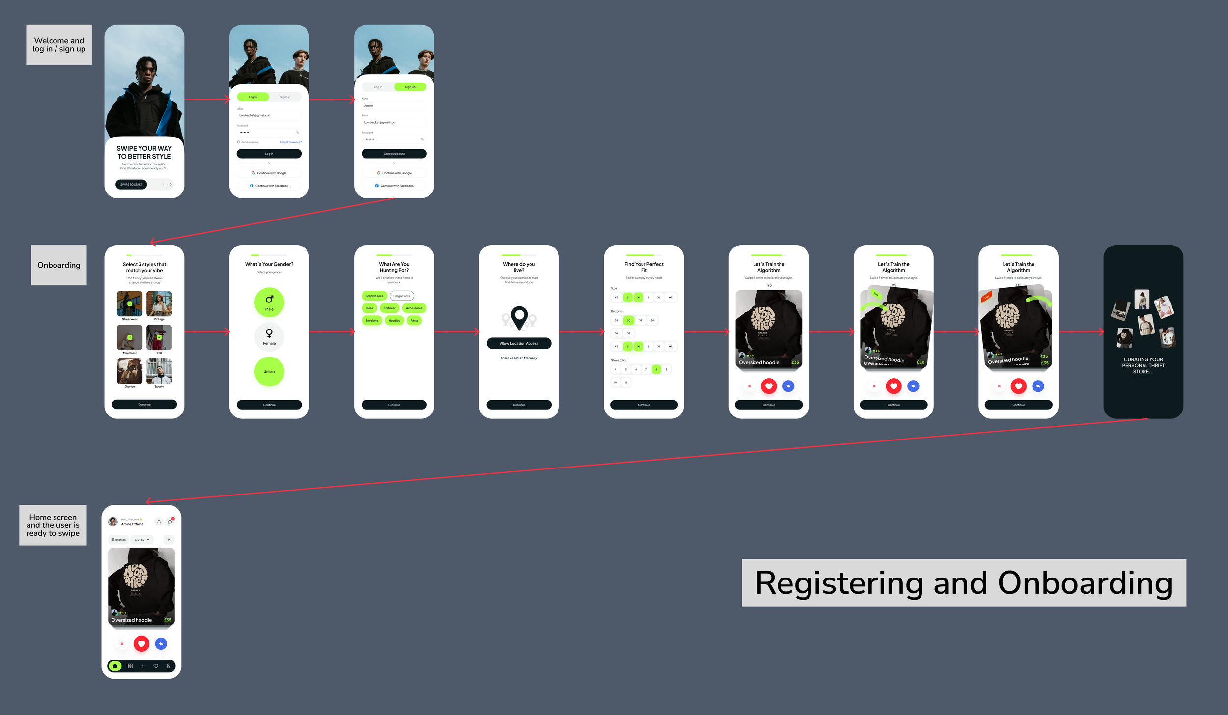
Three key user flows were mapped to validate that each core journey was clear, efficient, and free of unnecessary steps:
1. Registering & Onboarding Flow
A new user moves from the welcome screen through account creation, the style quiz, and location and fit preferences — arriving at their first personalised product feed ready to swipe.
2. Swiping & Buying Flow
From the home feed, the user browses and swipes, taps into a seller's storefront, sends a message, manages their liked items list, proceeds to checkout, tracks their order, and optionally leaves a review.
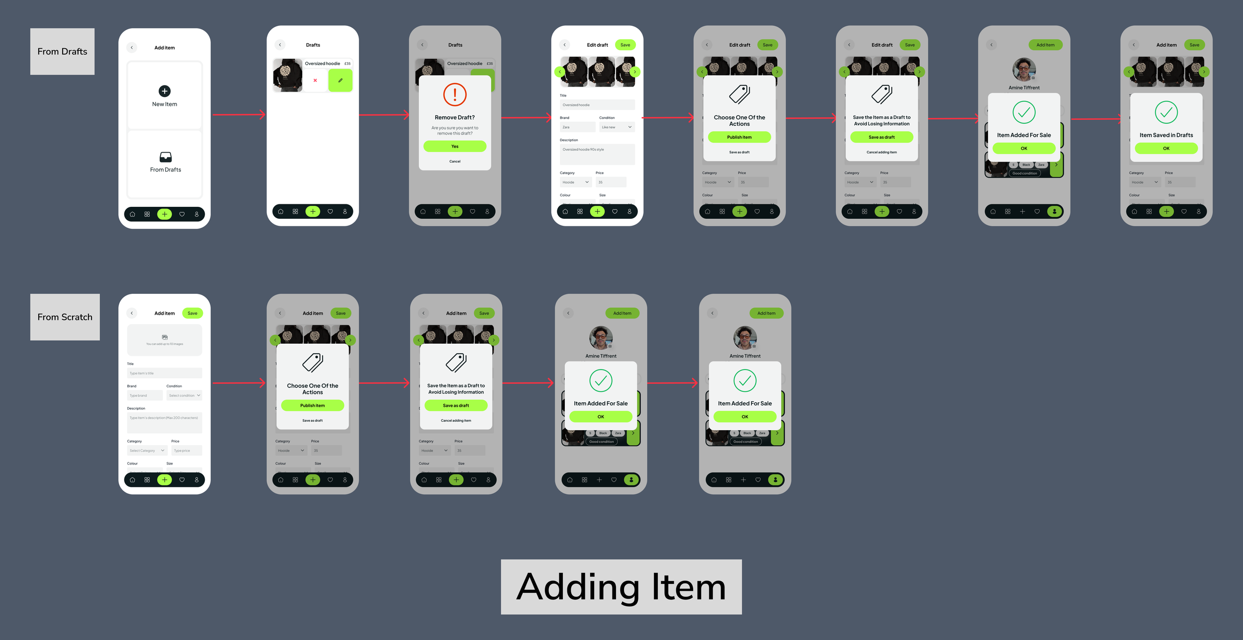
3. Adding an Item Flow
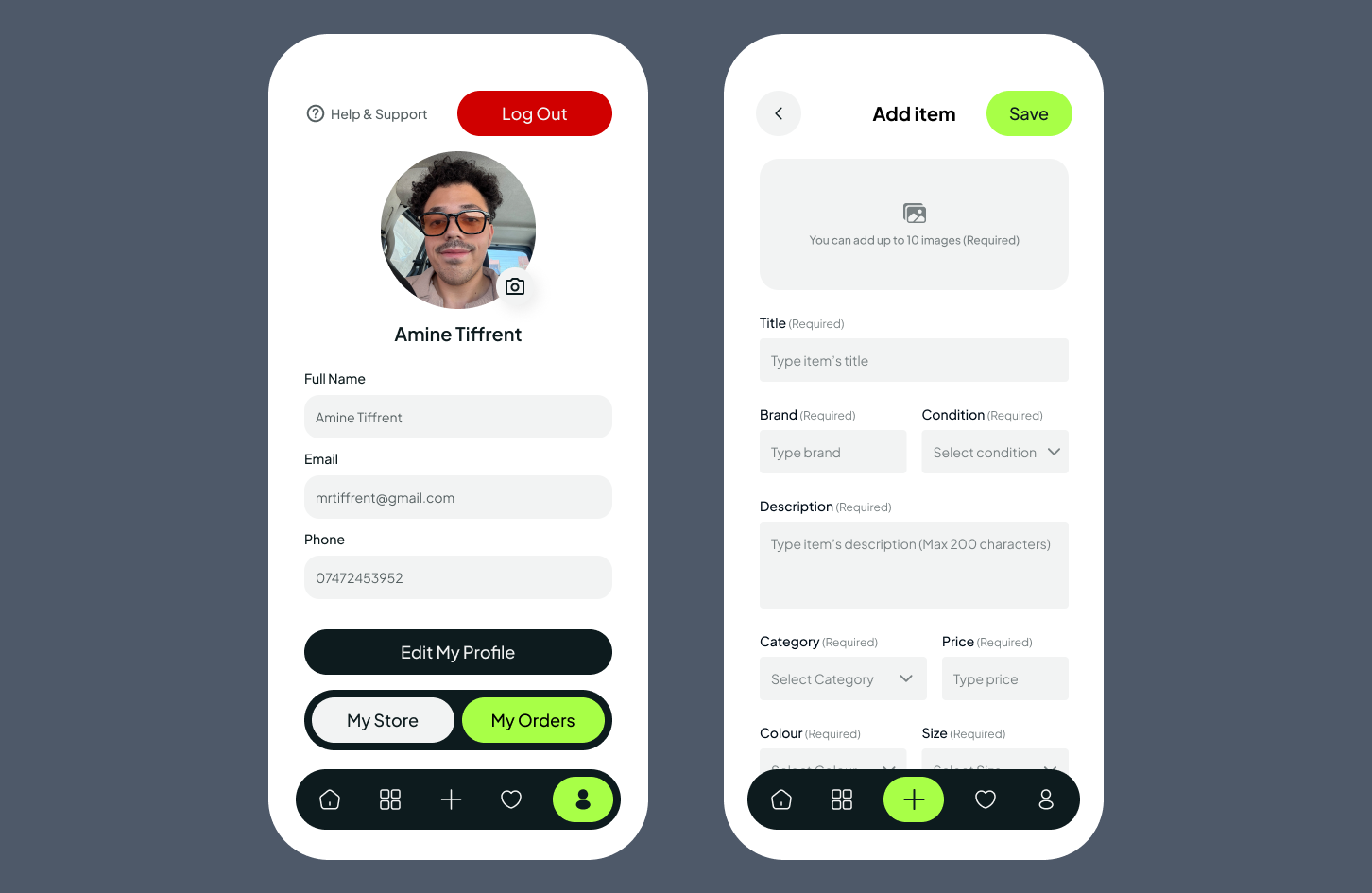
A seller uploads photos, fills in item details (title, category, brand, size, condition, price), previews the listing, and publishes it for sale — with the option to save as a draft or remove the item at any point.
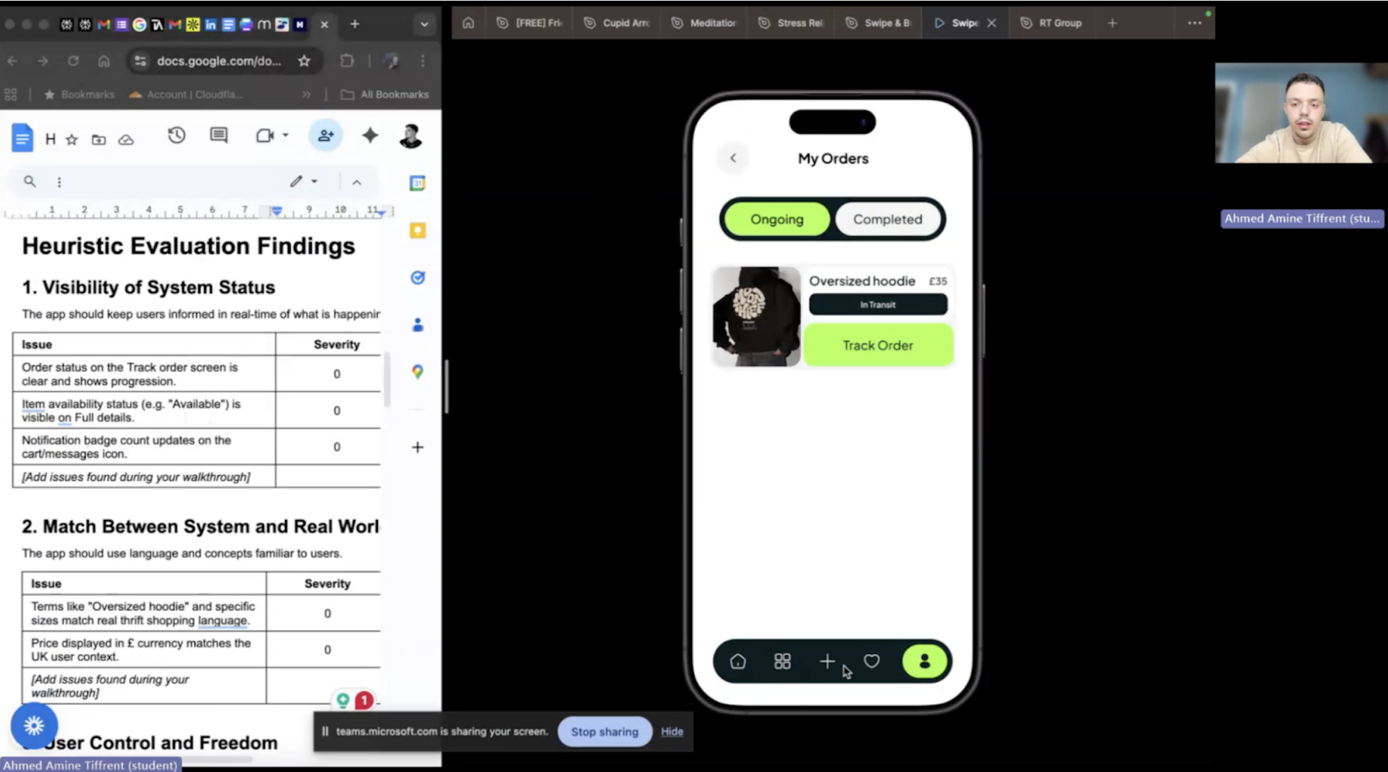
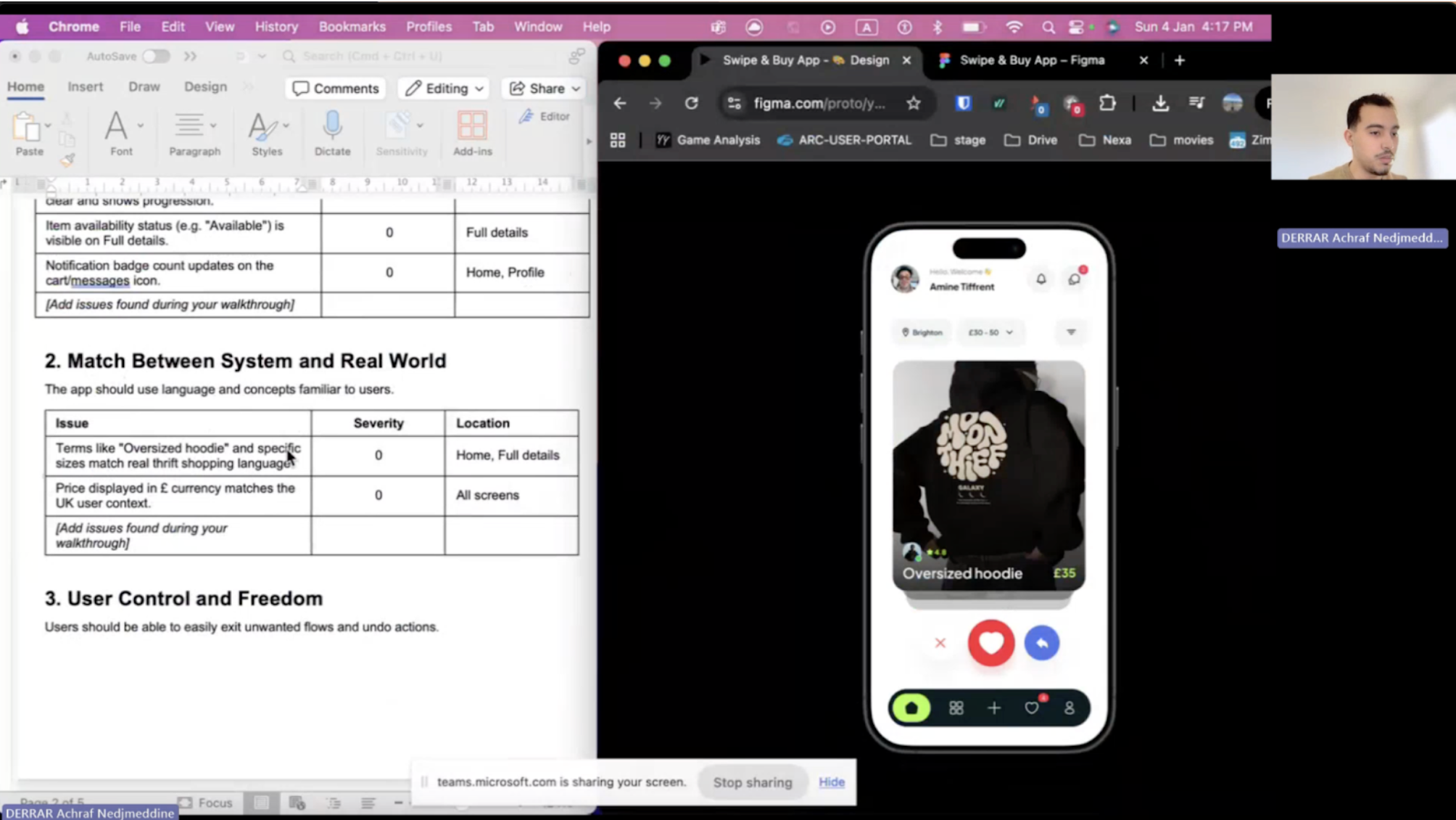
Heuristic Evaluation
With the prototype complete, a heuristic evaluation was conducted to identify usability issues before user testing. This method enables rapid, structured expert review, catching problems early when they are cheapest to fix.
Framework & Severity Scale
All four evaluators assessed the prototype against Nielsen's 10 Usability Heuristics, with a scale from 0 (no issue) to 4 (catastrophic issue) covering:
Visibility of system status
Match between the system and the real world
User control and freedom
Consistency and standards
Error prevention
Recognition rather than recall
Flexibility and efficiency of use
Aesthetic and minimalist design
Help users recognise, diagnose, and recover from errors
Help and documentation
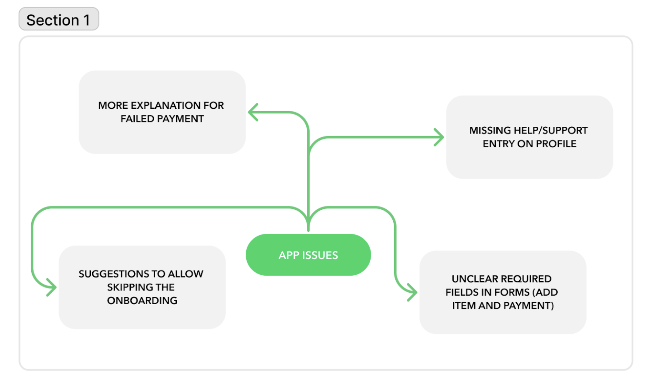
Key Findings
The overall usability baseline was strong, with many aspects consistently rated as 0 — no issue — across all four evaluators. However, three recurring problems emerged:
No Help & Support access: Users had no way to access help from within the app, violating the Help and Documentation heuristic
Forced onboarding: No option to skip the style quiz, potentially frustrating users who want to browse immediately
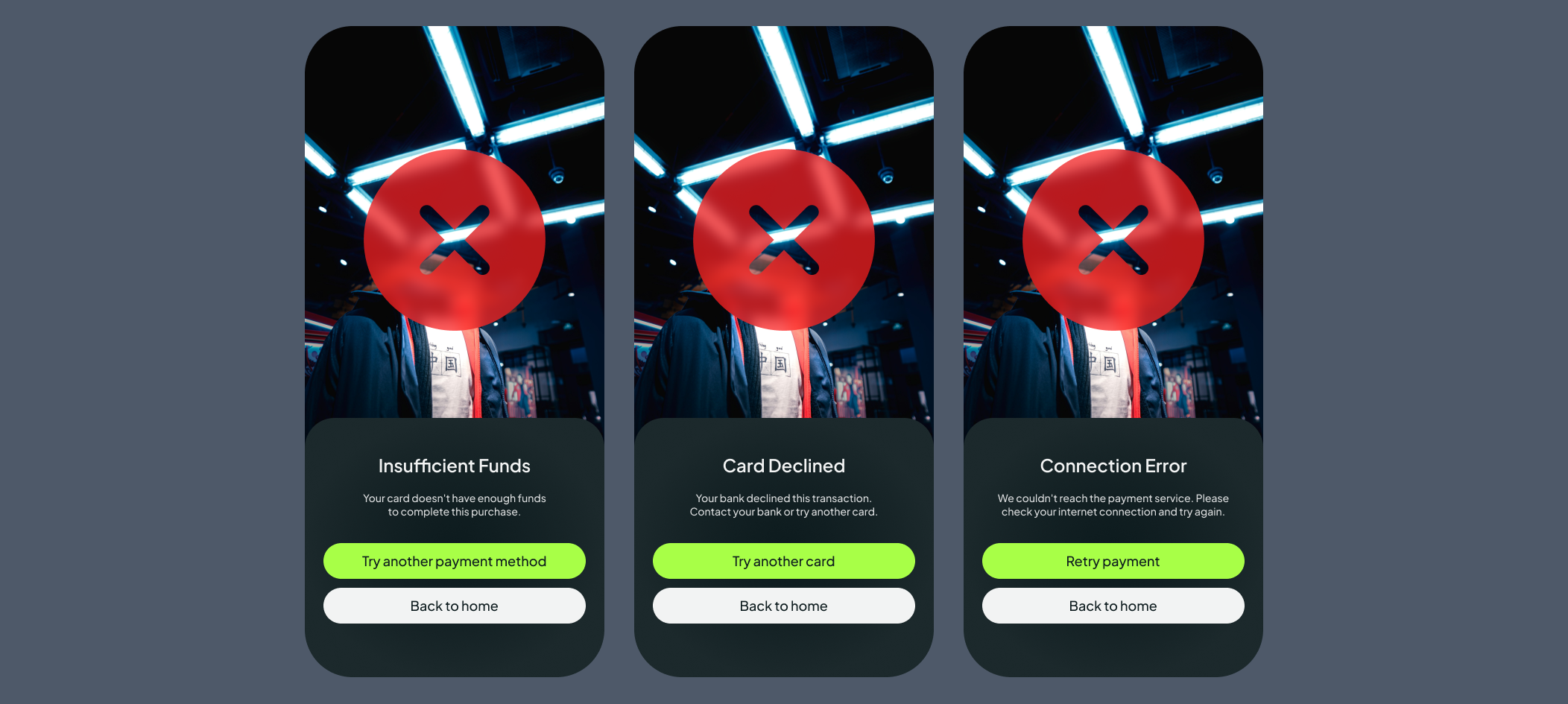
Unclear payment error states: A single generic error screen failed to communicate what had gone wrong or how to resolve it
Unclear required fields: no clear required fields * were marked in adding items and while making payments.
Design Changes Made
Each finding was directly addressed in a revised iteration of the prototype:
Added a Help & Support button to the profile screen header
Added a "Skip this step" option on relevant onboarding screens, and if the users skip many steps, a gentle nudge after their first few swipes — 'Complete your style profile to get better recommendations.'
Created 3 distinct error screens tailored to the most common payment failure scenarios
Added required field indicators on the item listing form
Reflections & Next Steps
Swipe Buy demonstrates that a human-centred process grounded in real research produces a product that genuinely solves a user problem. The swipe mechanic is more than a novelty; it addresses a real emotional gap in the thrift shopping experience, validated by research.
The heuristic evaluation proved particularly valuable. Four independent evaluators surfaced issues that would have been easy to overlook, reinforcing a key lesson: expert review and user testing are not interchangeable; they complement each other, and both are necessary.
Next Steps
| Timeframe | Recommendation |
|---|---|
| Short-Term | Conduct moderated usability testing with real 18–30 users to validate expert findings against actual behaviour |
| Test the revised onboarding skip flow and payment error screens with participants | |
| Full accessibility audit to ensure WCAG AA compliance across all screens and interaction states | |
| Long-Term | Integrate product analytics to track drop-off points, swipe-to-save conversion, and post-launch purchasing behaviour |
| Establish a continuous evaluation cycle combining expert review, usability testing, A/B testing, and data analysis | |
| Explore deferred social features — sharing liked items and following sellers — once the core experience is stable |
“Amine have done a great job in very short period of time. All my preferences and ideas were put together in perfect way and beautiful website.”
Kateryna Sierova - Photographer


“I am thrilled to share my experience working with an outstanding web designer Amine From the moment I engaged their services, I knew I was in capable hands. Their expertise in web design is unparalleled, and I could not be more pleased with the results.”
Sheikh Adiat - SMMA Agency
“Absolute pleasure working with Amine. Great communication, a driven developer and excellent service delivered consistently.”
Joshua Romao - Agency Owner


CONTACT US
CONTACT US
Have a design project in mind? Send me a message, and I’d be thrilled to discuss it with you! I’m excited about new challenges and look forward to connecting!